Brook House Place
Eccleston Homes is known for characterful, Arts & Crafts-inspired developments, timeless in tone, warm in feel, and distinctly traditional in design.
But Brook House Place changed the game.
This small and stylish development in Urmston introduced a bold new direction: clean-lined, design-led homes with an urban edge, aimed at a younger, more style-conscious buyer.
Brook House Place is where considered, contemporary design meets an unmistakable sense of community. With crisp architecture, smart layouts and future-ready features, it was a clear step into new territory.
For a developer so defined by a signature style, this was a bold move, and it demanded a sub-brand that felt equally fresh, without losing the trust and quality that Eccleston is built on.
Our approach
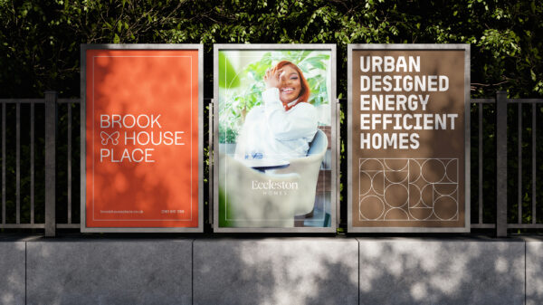
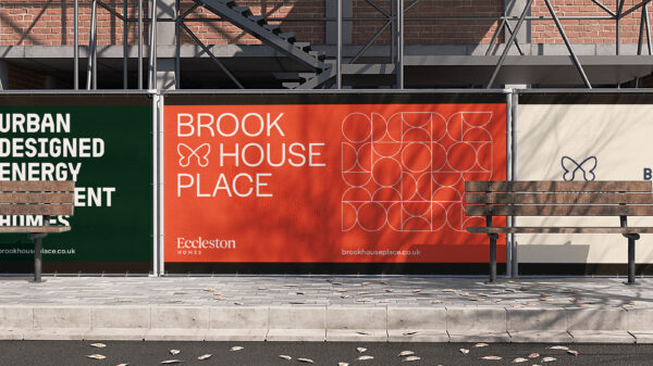
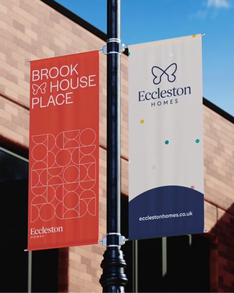
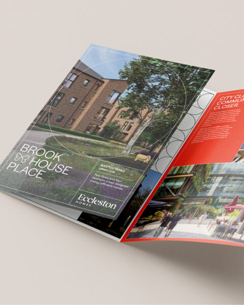
We created a new identity for Brook House Place that was confident, considered and quietly clever, just like the homes themselves.
The brand was shaped by clear insights into the homes and their buyers: this was modern, energy-efficient, design-forward living, on the edge of the city. Homes with solar, triple glazing and air-source heat pumps perfect for a generation who care about both form and function.
To maintain a link to the parent brand, we subtly incorporated Eccleston’s signature butterfly symbol into the Place ID adding a warm, recognisable touch. We also evolved the dot system into a more refined, flexible pattern that echoed the architecture’s rhythm and visual simplicity.
Other creative devices helped bring the brand to life:
- Isometric line drawings reflected the precision of the homes and the thought behind every detail
- A focus on lifestyle photography helped sell the feeling of living there, not just the features
- The brand tone was minimal but warm designed to connect with buyers, not just impress them
The impact
The Brook House Place brand gave Eccleston the freedom to speak to a new kind of buyer: design-aware, digitally savvy, and looking for modern homes with a conscience.
It allowed the business to confidently enter a new market space, backed by a visual identity that matched the ambition of the product, futureproofing the brand while remaining rooted in its values.
Brook House Place wasn’t just a new development. It was a new direction and a brand to match.
Related Work
View All