From disruptor to trailblazer
Building a brand for the next stage of growth
In just a few years, Catapult had grown from a disruptive start-up into one of the fastest-growing label manufacturers in the US, reaching $60m in revenue. Catapult wasn't trying to prove it belonged anymore. It was setting new standards for the industry. The challenge wasn't to reinvent Catapult. It was to create a brand that reflected the scale, confidence and ambition of the business it had become, and support the next stage of growth.
- Brand identity
- Strategy
Our Recommendation
This wasn't simply a visual refresh, it was a strategic repositioning.
We shifted Catapult from industry disruptor to industry trailblazer, creating a brand that reflected its leadership in innovation, responsiveness, technology and customer experience. Whilst they continued to challenge convention, they were now the ones defining industry standards.
We built the strategy around a clear proposition: Make Every Moment Matter.
This became much more than a strapline. It articulated Catapult's purpose and united everything the business stood for.
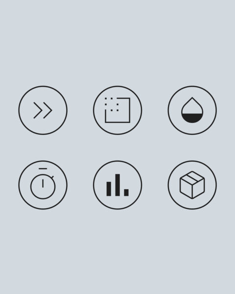
The new positioning was supported by six core messaging pillars covering mindset, simplicity, technology, innovation, data and people, giving the business a clear platform for consistent communication across every touchpoint.
Brand strategy
- Repositioned the business from disruptive challenger to industry trailblazer.
- Developed the Make Every Moment Matter proposition.
- Defined the brand purpose, positioning, personality and messaging framework.
- Created six strategic messaging pillars to support marketing, sales and recruitment.

Brand identity
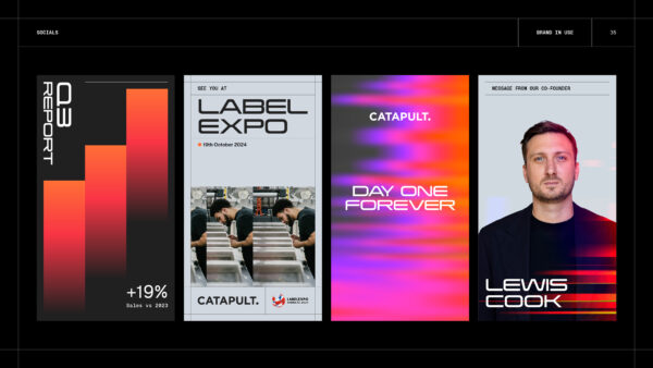
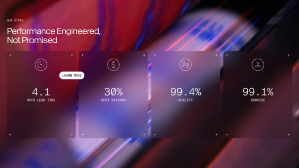
The visual identity needed to feel as engineered as the business itself. Drawing inspiration from precision engineering, high-performance motorsport and advanced technology, we created a sophisticated identity system that balanced confidence with pace.
The identity introduced:
- A more refined, premium visual language.
- Typography chosen to evoke speed, precision and technical excellence.
- Motion-inspired graphics and generative patterns that reinforce agility and innovation.
- Structured grid systems that communicate consistency and operational precision.
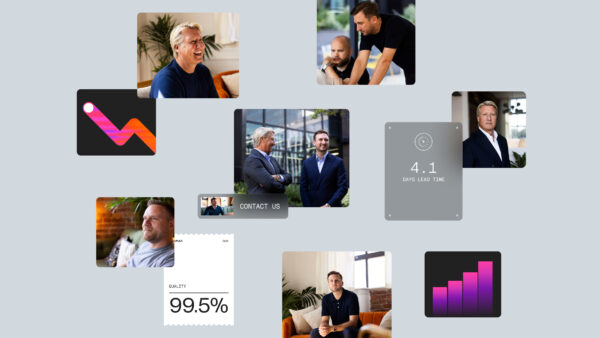
- Photography centred around movement, momentum and responsiveness.
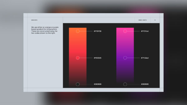
A restrained colour palette with bold accents, reflecting confidence rather than disruption.
The result was a brand that felt established, distinctive and ready for its next phase of growth, while retaining the ambition and energy that had fuelled Catapult's success.
What Changed
The rebrand gave Catapult a brand that matched the business it had become.
It aligned the organisation around a clear purpose, strengthened market perception and created a platform for future growth.
Most importantly, it positioned Catapult as a market leader rather than simply a challenger, supporting continued commercial success and a record period of new business growth.
So What?
Catapult has always moved faster than the market. Now its brand does too.
The repositioning marked a shift from challenger to trailblazer, creating a brand that reflects the pace, precision and ambition already embedded in the business. More than a new identity, it provides a platform for the next stage of growth, ensuring Catapult continues to set the pace for what's next.