The Art of Grabbing Attention

Last week, our Creative Director, Adam, went on a course at D&AD. Here’s what he had to say about it :
“Last week I went on a course at D&AD, which is one of the most renowned award shows in the world, and it was run by one of the top Art Directors, Alexandra Taylor. The course was aptly named, “The Art of Art Direction”. In it, we were shown tricks and techniques to grab and hold the attention of those that have ever increasingly smaller attention spans. Are you still reading this?
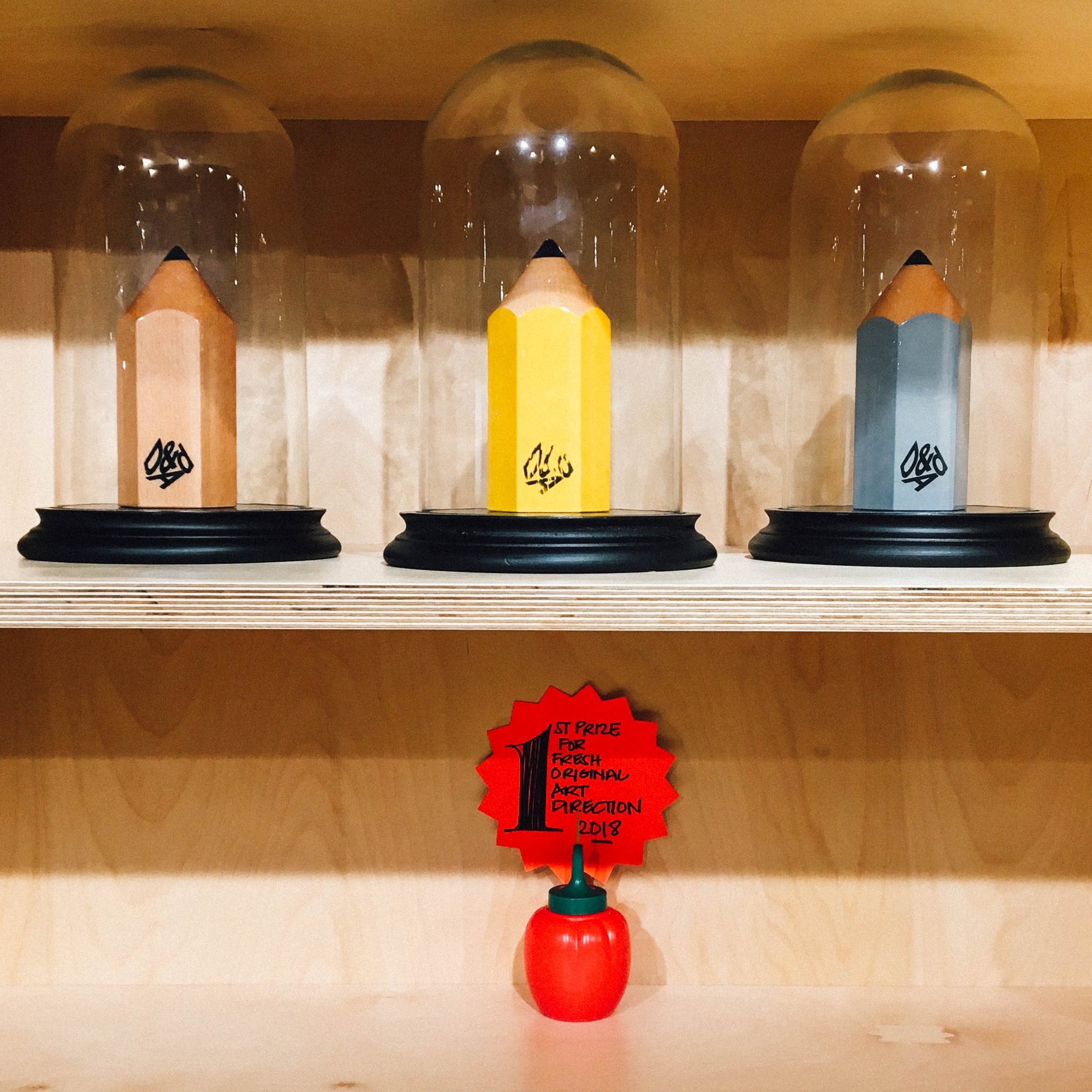
Alex talked through campaigns she’d worked on in microscopic detail; explaining her font choice and why that was so important; its positioning on the page and why that mattered; the size of the characters, alignment, letter spacing and why this would make such an impact. All that detail, explanation and reasoning was just for the headline. Needless to say we went through the rest of the ads, discussing every detail. From photography choice and grading through to body copy and logo lockup. Each had its own important reason for being on the page. It was impressive and awe inspiring to see the level of craft, consideration and compassion for Art Direction.
All in all it highlighted just how important it is to make our advertisements the best they can be. If we’re attracting the attention of the viewer, we need to make sure they’re attractive pieces of work. But (and fundamentally as important) we need to make sure our advertisements look “new”. “A new page” as Bernbach and Krone once suggested, “I don’t mean on top of all the latest trends – that just means you’re part of the club. I mean something that you or others have never seen before. That’s new.”
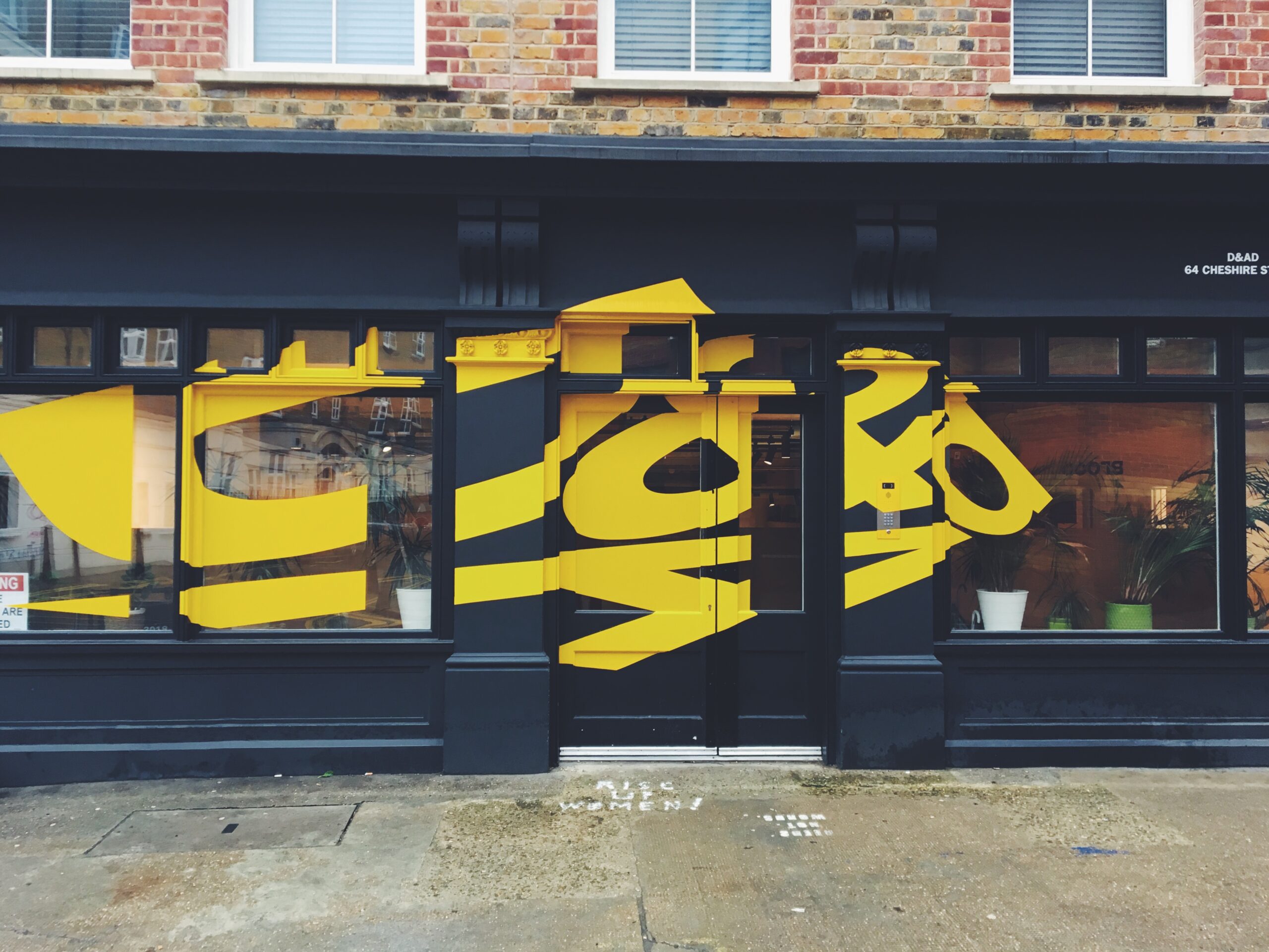
It’s important to say that Art Direction isn’t just a traditional job role. We didn’t just look at press advertising. Part of the course was looking at how Art Direction can better enhance digital work, TV, Direct response etc. And Alex’s top 5 rules for Art Direction covered off all categories beautifully…which will now remain my 5 secrets.
As part of the course, we, and several top London creative directors, were given the same homework. We were all asked to re-Art Direct the same press ad campaign – to make it fresh, new and original. In the class were Art Directors and designers from the likes of Y+R, AMV BBDO and some ex BBH and the Creative Directors were Mark Reddy, Steve Dunn & Alexandra Taylor. At the end of the course we revealed our work and had the opportunity to see what others had done. Alex then popped on her “witch’s” hat and critiqued our work. We all soon realised what worked and what didn’t. Following this we had a short break whilst she chose her top 3. And by the time we’d all made a brew, we came back in to a mini awards ceremony. I’m super pleased to say that I came first, but more importantly I know why I did.
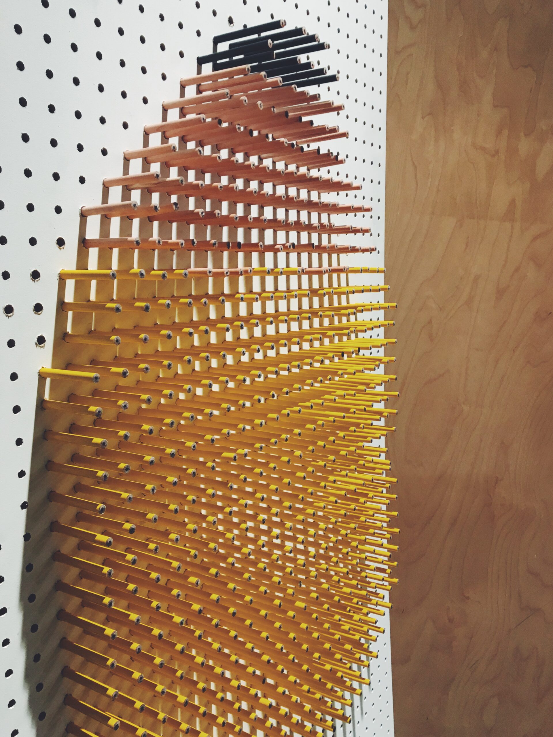
But what does all this mean on a day-to-day level? It highlights the importance of creating stand-out work. In any media and every format. Making work look and feel different (and not just saying you want to be). Creating a new piece of art. Every. Single. Time.
We all came away fully appreciating the importance of being relentless in the pursuit of a new layout. Whether that be a new illustrator, new photographer, unique camera angles, grading or new combination with the same elements. So, in short, crafting it to make it look beautiful and relevant for those we want to engage.
Art Direction is an art then, but it’s an art of grabbing attention.”