7 F&B Brands We’re Loving in 2021
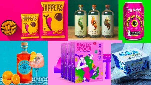
We caught up with our Brand Director, Danni Bramall, to find out the F&B brands that have caught her eye this year. Overseeing the design and artistic direction within our brand agency, Danni knows how to give products the ‘wow factor’, tell stories through the creative and create memorable artwork that drives brand loyalty.
She broke down what she loves about these brand designs, what makes them stand out and specifically, why they resonated with her. Check out her top F&B brands to watch in 2021 below..
1. HIPPEAS
“We’re changing snacking one puff at at time”
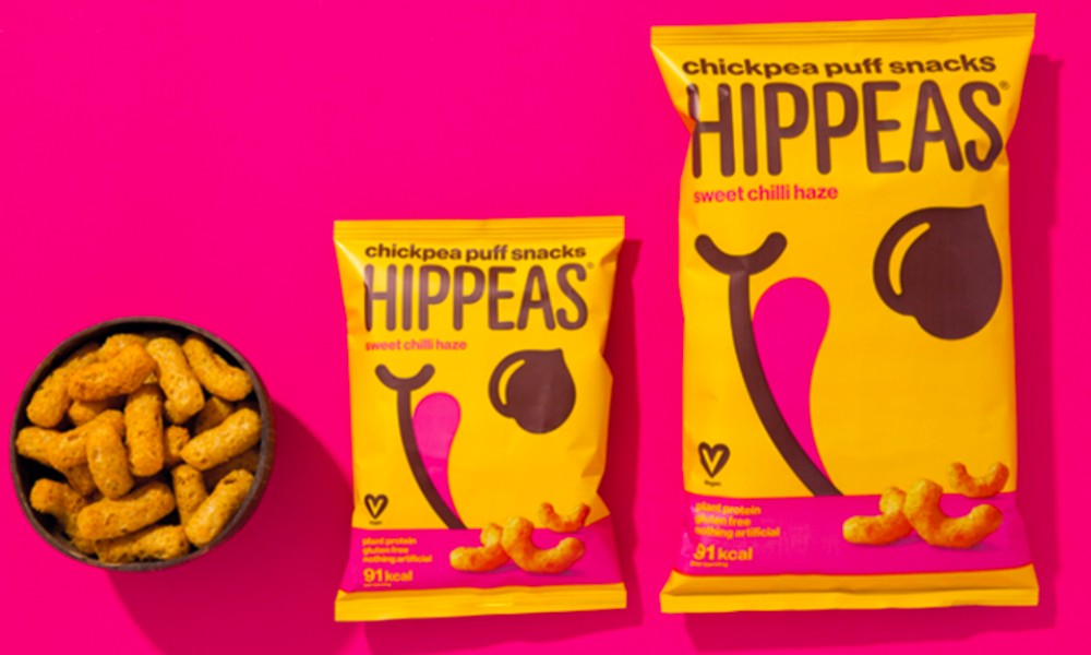
I have loved this brand since they launched. One of the main reasons was the striking balance between organic, natural cues with a real injection of colour and a strong personality on pack, whilst understanding the playful place of where it sits as a brand.
Showing that you can have fun with an organic product and not always too focused on the origin. You then learn that they are fully sustainable, socially conscientious… oh and the biggest thing, they taste pretty good too.
“Give peas a chance” – as they are partnering with some excellent charities, please check them out and get yourself on the pea waggon.
2. SEEDLIP
“What to drink when you’re not drinking”
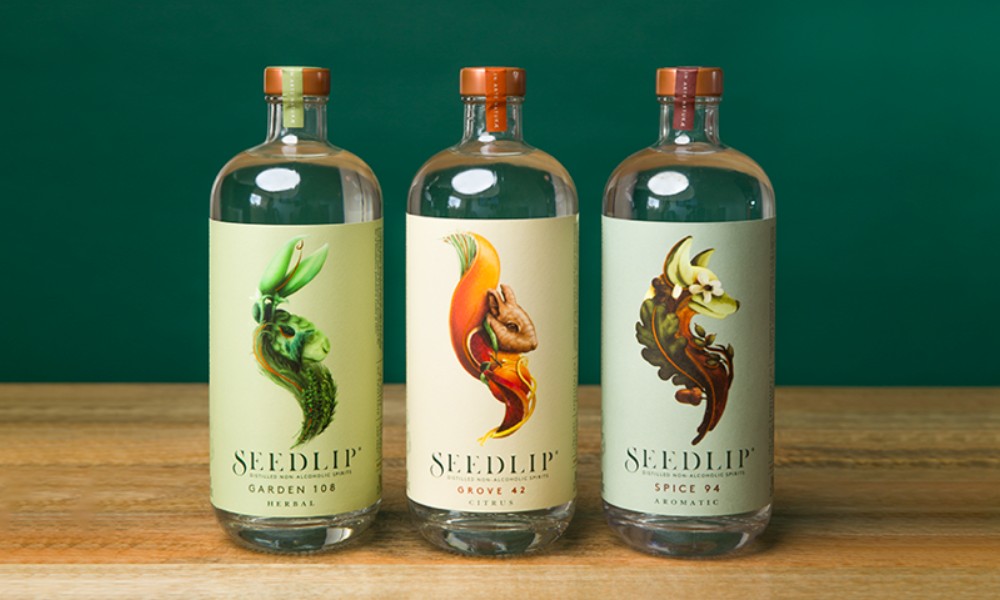
Working in building brands for the FMCG sector the one thing we strive for is “stand out on shelf” and I remember walking through the aisles and stopping to look at Seedlip. I took a picture on my phone and sent it immediately to my colleagues. When something is as eye catching as this it’s due to truly original craft and it’s doing it’s job – stopping someone in their tracks (literally).
If you are lucky enough to have an open brief where creative blue sky thinking is on the table, then this is where a design can end up being truly amazing.
The non-alcohol category is growing year on year, so it’s refreshing to see such amazing alcohol alternatives – giving people more choice to go tee total with pride. No longer are those moments taking a standard zero beer to a BBQ, you can actually walk in with an impressive conversation starter like Seedlip.
A great tasting Gin alternative, clearly inspired by nature with its distilled herbal remedy, plus they are from our neck of the woods, the lovely North of England.
3. MALFY GIN
“Embedding the essence of La Dolce Vita”
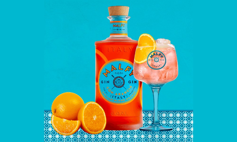
I love a good Gin and people who know me know this, BUT I’m certainly not brand loyal (yes I said it) to one Gin brand – the reason is I’m always glamoured and tempted away by the newest Gin on the block.
During last Summer’s lockdown my sunny tipple during the early heatwave was purely bought on the way it looked. Not only does Malfy Gin provide a pretty Instagram post but it’s also the perfect taste to transport you to the beautiful Almalfi coast. During a time when the only travel allowed was to the back garden this drink gave me the little escapism I needed.
It screams class and cool combined – the colours just feel the perfect mix of aqua Mediterranean blue and punchy orange with the label itself representing the fruit. It’s hard to be simple and clever but the Sicilian Malfy blood Orange does just that – a tasteful design with a taste of the old country.
4. RODDA’S CLOTTED CREAM
“Growing since 1890, supporting Cornish farming families”
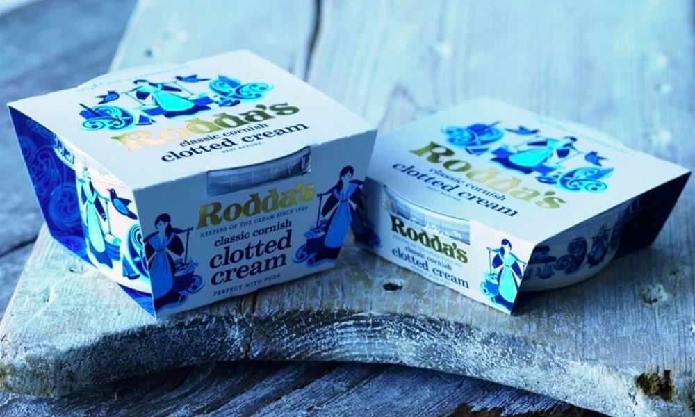
Last year some were fortunate enough to manage a cheeky overseas trip, but the majority chose to stay-cay instead. I have always wanted to visit Cornwall after hearing so many wonderful things about the landscape, beautiful scenery and breathtaking coastal views. Staycations for most have been a true eye opener to how lucky we actually are to have places to visit such as Cornwall.
Visiting Cornwall for the first time we had to indulge in Afternoon Tea (I’m not much of a sweet tooth but Rodda’s clotted cream with jam is now a new favourite).
Anyway, I didn’t only love it for the taste, the packaging and branding is exactly what I’d want to see from a traditional Cornish family owned brand. The cute folk like illustration that represents a slight nod to Eliza Jane back in the 1800’s, gives you a sense of pride. There’s simplicity and quality with a touch of gold foil for the family name.
The packaging is telling a wonderful story, knowing as a consumer this is a real family with handed down cream making techniques which is perfectly executed.
5. LAND CHOCOLATE
“Take life by the beans”
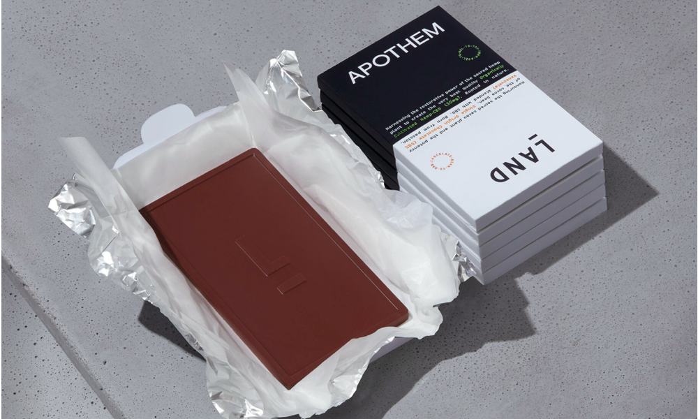
I’ve been lucky enough to work on various confectionary brands but this is a design I would have been thrilled to have been a part of. As a brand creative it’s a rarity to have a brief so daring in this category like Land Chocolate. It takes some guts to go down such a modern clean type route and for me the risk has more than paid off.
Land as a brand is so different to what you’d typically expect from a confectionery design. This is screaming confidence whilst showing considered methodology in his product making – a seriously modern high end looking chocolate bar.
Created and made by Phil Landers it is a really touching story of leaving a life of media for an adventure to then a discovery of chocolate making.
Based in East London and supplying a very selective and considered product range, Phil tells of being “at home in and out of his sugar pit and into the kitchen, making use of an Indian spice grinder and a hairdryer to form his first bars by lamplight”. It really emphasises passion for his product and we should all be supporting independents that are producing excellent products like this.
6. MAGIC SPOON CEREAL
“Happiness 100% guaranteed”
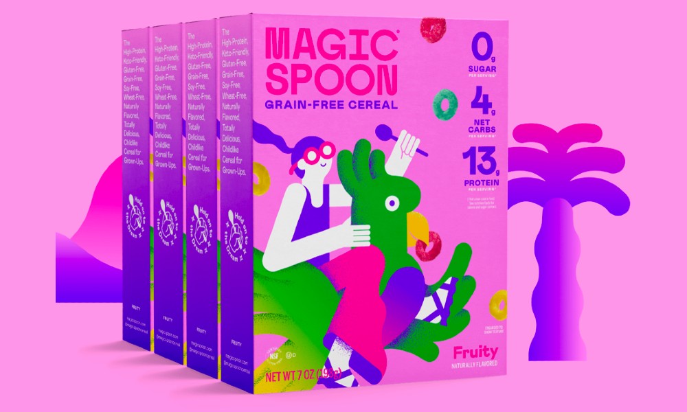
I love reading Fast Company to keep up with trending topics and also see ace stuff that I would never normally see.
They featured Magic Spoon a while ago now and even though I’m not a massive cereal lover the packaging design was that perfect balance of quirky Beatles Yellow Submarine vibes and the cool trippy world of ethereal acid pop bursting with imaginative characters. For their guilt free ‘kids’ cereals for grown-ups it is just perfect in design.
Their success is in having a huge buy in from Magic Spoon loyalists which I’m positive it’s all down to the product BUT the brilliant branding is no doubt helping create a bit of a new cult classic.
Give them a follow on Instagram for a playful tone of voice and community love. Get a hit of guilt free junk cereal and get spooning.
7. TINY REBEL
“Our bear evolved from a rabbit.”
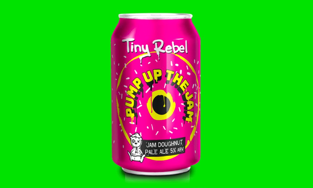
A never serious street graffiti style wrapped in 80’s rebellion. Nostalgia design at it’s very best for this award winning beer brand.
First seen on Saturday Kitchen recently this Pump up the Jam design takes me straight back to my obsession with hip-hop back in the day (really trying to keep up with Vanilla Ice, stopping the cassette every nano second). We are currently living in an age of nostalgia and us 80’s kids cannot get enough of these modernised yet lived in graphics that are having a deserved revival these past few years.
These guys like most independents have a great story of home brewing but their accidental branding journey is a pretty unique one and sometimes naming just hits and then sticks (Tiny Rebel coming from Brad’s brother’s separate business, which was inspired by his son).
I am very much looking forward to checking out their Brewery Bar this Summer when restrictions lift but for now the 4 pack will do – it’s more than worth buying just for the genius Rubik Cube packaging.