Death of the static: why your next favourite brand might be a GIF

For the past few years, brands in motion or ‘branimation’ (cringe) has been top of the annual ‘trends to watch out for’ lists across the industry, including our own. You can count on it being featured again next year, and the year after, and so on.
At what point do we accept that motion forming brand identities has surpassed the status of a trend, and what does that mean for the future of static design?
Print fanatics of the world, don’t get us wrong – we, like every other creative agency out there, believe that print is firmly not dead, but we can’t escape the reality that the digitalisation of brands is only going in one direction. Motion, or video, has been a constant catalyst for change: we’re moving from text messages to GIFs, from phone calls to Zooms, cookbooks to tiktoks – even our gallery walls are moving.

Since 2020 our behaviours on where and how we consume brand marketing accelerated the inevitable, and our desire (or demand) to experience a 24/7 brand presence from the convenience of our device presents new opportunities and levels of attention where static design can’t compete.
We’ve always known motion to be a powerful visual tool, but it historically has been a medium stigmatised for being : a) inaccessible and b) expensive. The democratisation of technology and advances in software has equalised the marketing landscape, allowed a wider platform for brands to create and experiment with motion. The effect is an infinite overload of fast, hypnotic content which plays automatically without a care to stop.
How ironic then that in the migraine-inducing noise of constant attention-seeking marketing, it is still motion which so often captures us mid-scroll and crashes us to a halt.
Static design can only watch on in its limited, rigid form; clinging to the smoky nostalgia of yesteryear when a room full of suspenseful clients held their breath on a team of Don Drapers ready to unleash and undress a singular stationary piece of still life that would have sent ripples throughout the advertising industry.

Think about the last time you saw an airline logo, or the Olympics. Was it on a piece of print, or was it on a website, or a social post, or a TV ad?
The odds are shifting to the point that a new brand identity will most likely be seen first on a screen. So, this poses the question: if we’re so aware of the exponential success of brand performance and recognition across digital devices, then why are we still designing and creating identities through the static limitations of those Madison Avenue print days of the past?
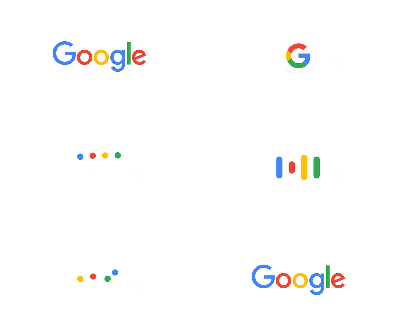
In principle, a logo, or a brand mark, is a combination of symbols, typography, and colours (sometimes photography – I once had a logo which was literally a labrador). The job of a logo is to differentiate itself from others, to simplify the process of what we recognise as one noun from another. Where does it read that this has to be a JPG? How about designing for a GIF or an MP4 first?

Maybe now it’s time to throw away those old dusty bibles of iconic logos, and instead to replace our bookcases with unused mobile devices looping your favourite GIPHYs for inspiration instead.