On the prowl at OFFF Fest…

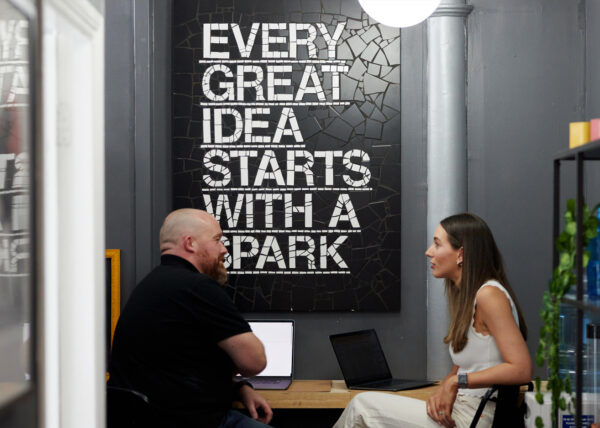
Last week our newly minted Deputy Creative Director, James O’Connell, was sent to Barcelona. He was there to sunbathe and indulge himself attend the prestigious OFFF Fest, an international festival of design that brings together some of Europe’s best and brightest minds.
Billing itself as a community for “all those who are eager to learn to participate and get inspired,” OFFF is a three-day journey of conferences, workshops, activities and performances. It features a slew of offline/online designers, motion designers, thinkers, sound designers, graphic designers, theorists, developers, professionals, students, it is a creative hub in the heart of Catalonia.
This is what James learnt…

James: So, here’s the low-down on what I learnt at OFFF…
First off, design is no longer just about “work” work. Personal projects are important, but not only the ones that we do ourselves out of work. Often some of the best are the ones that we bring into our agencies and work on as if they were actual client work. In fact, a lot of the personal projects are the ones that tend to catch the attention of the blogs. For example, when the Kim Kardashian book came out, the team behind it sent a team out to take pictures of the book in front of famous gallery portraits. The earned media from this was phenomenal.
Continuing on this theme, one of the speakers came from an agency called Sid Lee. They had a really interesting tagline ‘Proudly Wasting Time & Money Since 1993,’ along with this video:
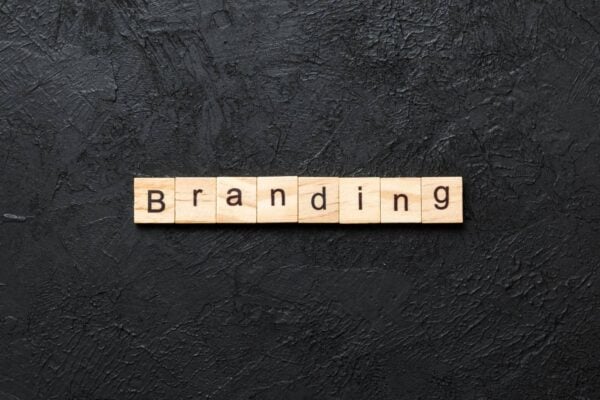
Amongst the speakers was Paula Scher from Pentagram, who was rattling through some branding work. In particular she had some great pieces for wayfinding systems. The best part was that, although it all seemed quite straightforward and simple, everything had a core “thread” running through it that tied the whole idea together.

Tony Brook of Spin was also present and revealed a new logo for one of our own clients: Ministry of Sound. At first it seemed quite random and geometric, but upon closer inspection it started to make more sense. Very much in the “evolution not revolution” theme, by keeping the core shape but experimenting with blocks and forms the new logo evokes just enough of the old, familiar one to act as a bridge between the two. It’ll be interesting to see how the public responds.