Salut(e)! Au revoir!
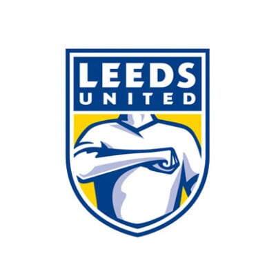
Our new CD, Adam, has something to say about the new Leeds United crest :
I’m always a little bit reserved when I write about a branding project that’s been produced by another agency. You never know what the brief was, who was involved, what the feedback might have been etc. All these little interactions can direct the design massively. But it’s been suggested that over 10,000 people have influenced the latest crest for Leeds United. And it doesn’t seem to have gone down very well by the looks of things. But, 10,000 people? That’s way beyond ‘design by committee’ and more like ‘design by community’. I’d go as far as to say nothing, no matter what it is, will ever turn out great with that many people involved. Too many cooks and all that.
As an outsider it’s very easy to ‘look in’ at a rebrand and suggest it’s not right. But… I do think it’s very American. And the whole salute thing doesn’t seem right for a crest, in this country at least. But then again, something that goes against the grain is always going to get more attention and create a mass debate. I think automatically one would want to show the club’s heritage with a crest – but this doesn’t seem forward facing to me. The other big consideration with football insignias is, “would someone have this tattooed on their body?” – so, er, yeh.
What I will say is, that typographically, it’s a massive leap forward compared to their previous shield. And idea wise, it’s not a bad idea. It just hasn’t worked when it’s come to the execution.
Last, but certainly not least, it’s a man on the shield. Leeds United is much more than just the men’s first team; they have a female football team as well as die hard female fans. So for me, it doesn’t seem to be sending out the right messages overall. And it’ll be interesting to see if they approach this project in the same way next time.