Blendsmiths: Crafting an NPD identity for the Oat Milk market
Before we launch into this case study, it's worth noting that this was a pilot project for a New Product Development that didn't make the shelf. However, we all agreed that the design work was too good not to share. Blendsmiths, the drinks brand for the curious, was venturing into a new territory: the oat milk market.
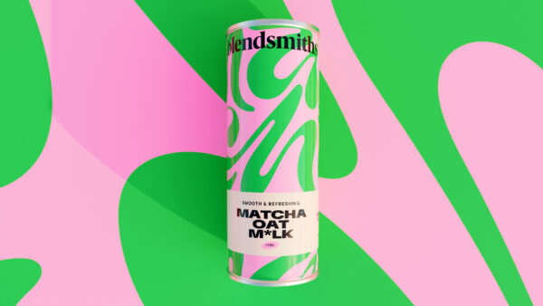
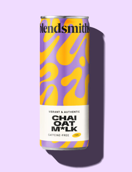
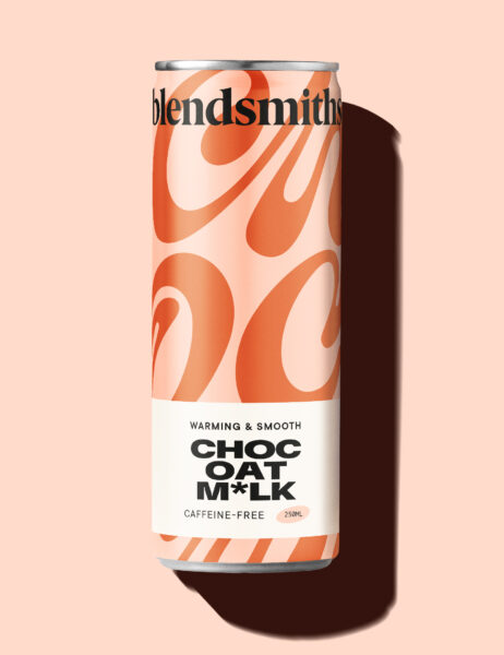
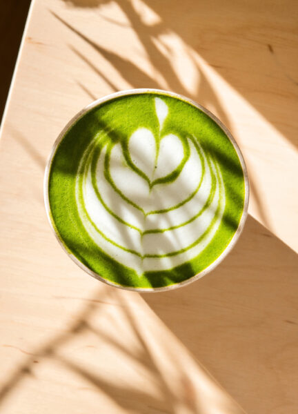
It would be the same drinks concept that customers know and love, bringing together a blend of both popular and unique flavour pairings, for our audience that had a thirst for new experiences. But this time, they would be blended with oat milk and ready to drink from a can. The range included 3 unique flavours: Choc oat milk blend, Chai oat milk blend and Matcha oat milk blend.
We conducted a short research investigation, followed by a strategic approach, conceptual territories, and finally into design and artwork. The ‘ready to drink’ market is competitive, although the existing branding was vibrant, we felt the can design would need to push further to ensure it not only stands out on the shelf but also embodies the playful personality that defines us.
- Brand
- Typography
- Packaging
A design that was crafted for the curious
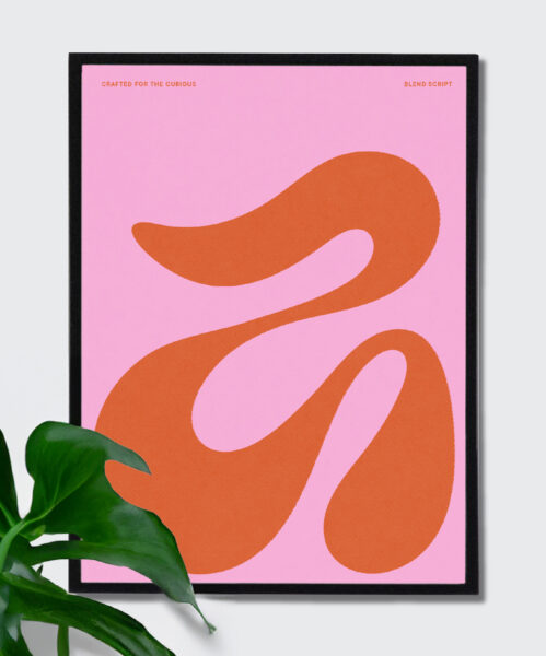
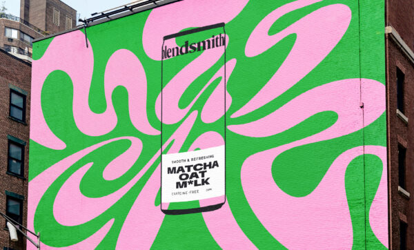
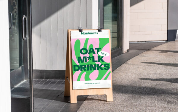
Before diving into the creative process, we made sure to do our homework. We researched category and industry trends, uncovering an interesting marble typography trend that was emerging. This seemed like a perfect match considering our brand's existing swirling lava lamp graphic style, this felt like a natural progression, promising to inject more impact into our can designs.
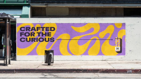
In our strategy sessions, we discussed the importance of shelf appeal and captivating our customers' attention. We crafted a unique typeface, inspired by the marble trend, to showcase key flavours such as Chai. We wanted to ignite curiosity, in line with our brand positioning of being 'Crafted for the curious' and physically make the customer lean into the shelf to reveal the message created within the type design. we also designed a ribbon graphic to neatly present flavour messaging with a playful tonal twist with the use of the asterisk in ‘m*lk’.
Moving the branding forward, whilst staying
true to our DNA.
Founded in 2017, we strongly believed that we shouldn't veer too far from the original branding that resonated with our existing customer base.
The lava lamp graphic style was part of the core branding, and we felt that it had plenty of potential to be evolved and stretched, allowing us to achieve our bold design ambitions without straying too far from our foundations. We also opted to use the existing vibrant and colourful brand palette rather than a completely new design approach.
Although this pilot NPD project never fully rolled out onto the shelf, it was loved by both the client and the agency. So much so that the evolved marble typography graphical style was adopted into the core brand identity and subsequently developed into more recent product ranges. As with most projects, planning is crucial, but it's also wonderful to have the freedom to let the creative process naturally unfold and influence in ways that you can't always plan for.
Ready to make your brand Unstoppable?
Let us help you reach your goals:
Stand out in your market
Maximise impact with insight-driven creativity
Turn complex solutions into compelling campaigns
Creative Spark is the agency that gets it done. See how we can transform your next campaign. Book a call today.
Related Work
View All