Parfetts
Parfetts is the UK’s fastest growing symbol group and the home of Go Local, Go Local Extra, The Local and Gold. Having benefited from a huge amount of growth throughout the pandemic and beyond, Parfetts wanted a new way to drive revenue. With a North West base of cash and carry’s, and of course, the stores to supply to, it was clear that they had the perfect set up to launch their own range of own-label products. In order to have the gravitas on shelves that these products required to be a success, it was essential that we didn’t create me-too products. Whether it be a bottle of brandy or a pack of popcorn, these had to be individual brands in their own right.
- Brand Campaign
- Typography
- Photography
- Art Direction
- Social
Finding our spot on the shelf
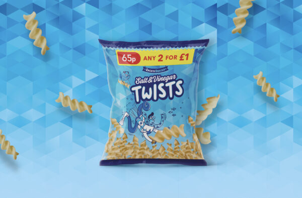
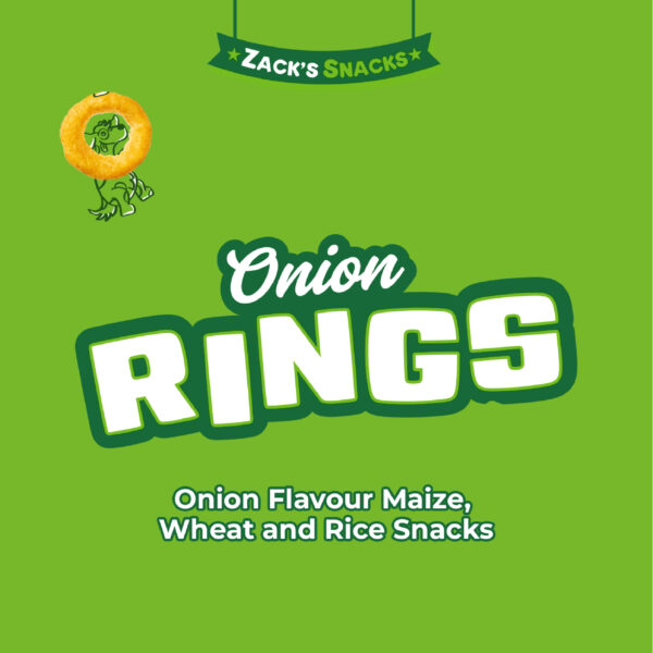
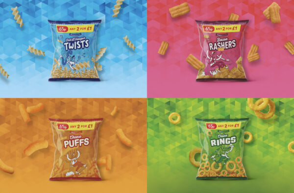
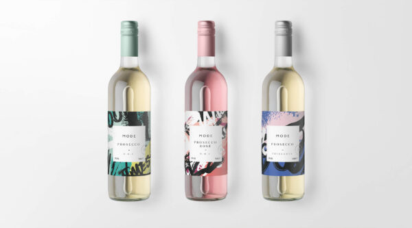
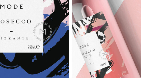
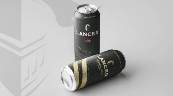
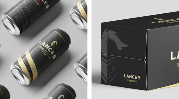
We created a number of brands for Parfetts - a range of spirits, including rums, brandy, whiskey, vodka and gin, wine and fizz, energy drinks, kids crisps, popcorn and sweets. Some were purely conceptual and future-thinking, whilst others are displayed proudly on the shelves, and indeed, in their customers baskets!
For each product we always carried out the same process, beginning with market research. Once we had a clear understanding of our competitors, we could find our gap.
No matter where it sat though, it was essential that it still had standout. We needed to convince consumers to ‘give it a try’ over a well known competitor, and keep coming back.
Creating something unique
The packaging designs were always created with the print process in mind - for some products we had free reign to think about special finishes such as foiling, embossing and metallic inks, whilst others were required to abide by a set amount of colours.
Illustration or photography, or indeed a mixture of both, was key across most designs. Both ensured our brands were bespoke to Parfetts and added impact to them far beyond generic stock.
Building brands
Once we’d found our gap, we presented creative territories to the client, and with a clear direction, we formulated a creative brief for the team.
We had to think bigger than the product itself - how does the brand speak, how does the brand feel and of course, what is the brand called? Naming was always collaborative, the whole studio was involved to bring the product to life. We’d then ensure the chosen name was safely trademarked.
Ready to make your brand Unstoppable?
Let us help you reach your goals:
Stand out in your market
Maximise impact with insight-driven creativity
Turn complex solutions into compelling campaigns
Creative Spark is the agency that gets it done. See how we can transform your next campaign. Book a call today.
Related Work
View All