Working with Creative Spark gave us a clear strategy and a brand that truly reflects our values—it's been a game-changer for our growth.
Swift Dental
Driving Swift change for Swift Dental
There was no doubt that Swift had a brilliant foundation in place in terms of their business stability and offer. They had found themselves in a unique position as market leaders but still only owning a fraction of the market. Their brand and marketing strategy were holding them back. They didn’t communicate the value and the benefits of their offer effectively and their brand identity was dated. In the words of Swift: ‘I want Spark to gather our thoughts and beliefs together, so we can clearly communicate what we are so proud of and better demonstrate our passion to our customers and encourage them to feel the same’.
- Brand
- 3D/Video
- Stategy
- Marketing
Providing Clarity And Consistency
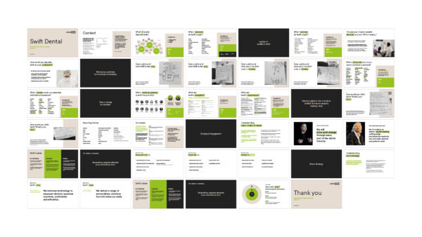
We initially carried out a research task to understand the perceptions of the brand across the industry and the main barriers for conversion. Using this as the starting point we carried out a workshop to further understand the business goals and objectives in order to define their brand strategy. It was clear that Swift needed to engage existing and new customers and be seen as future-focused and market leading dental lab that offers the very best in quality, price and importantly, customer service.
We developed a robust brand strategy with a strong vision, mission and values at the core - providing the entire organisation with a bigger purpose - driving swift change through every part of the dental industry.
Crafting a Unique Mark
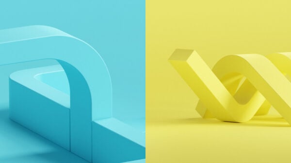
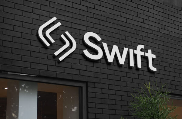
We developed an impactful brand for Swift that set them apart from the rest of the market which felt cold and stereotypically clinical. By merging the Swift ’S’ and arrows to represent their progressive nature, we formed a unique brand marque and logo.
By creating bespoke CGI versions of their logos it gave the brand a high end feel - again differentiating them within their space and creating awareness and recognition of the new offering.
Remove Uncertainty
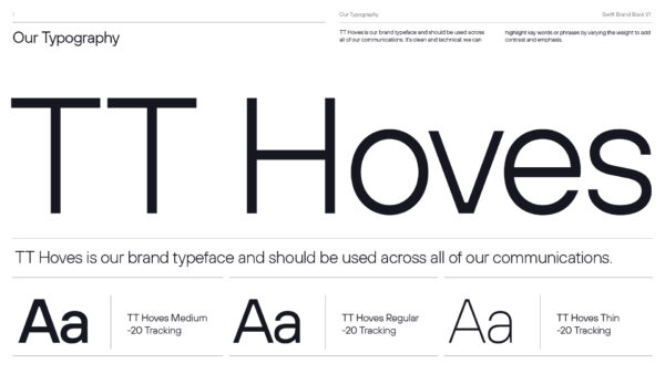
We chose TT Hoves for the typeface - a clean, technical and geometric typeface which combined their embrace of tech with their desire to be cutting edge, without feeling alienating.
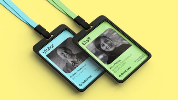
We used a mainly monochromic scheme to give the brand a tech feel and position them as innovators in the industry. However we gave it a uniqueness, warmth and clinical edge by introducing a mint blue, fresh green and yellow.
High Impact Messaging
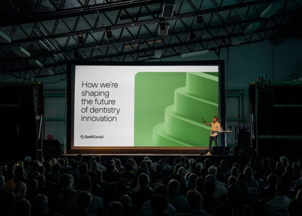
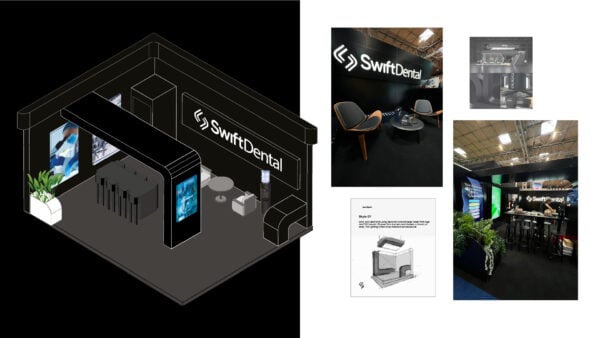
We also worked with the team to craft an effective suite of messaging containing succinct messages for each key audience along with overarching messages for wider reach. These messages were brought to life e across a marketing strategy, brand collateral including a bespoke exhibition stand build at the NEC and soon, their new website.
Ready to make your brand Unstoppable?
Let us help you reach your goals:
Stand out in your market
Maximise impact with insight-driven creativity
Turn complex solutions into compelling campaigns
Creative Spark is the agency that gets it done. See how we can transform your next campaign. Book a call today.
Related Work
View All