“It’s been a fantastic experience working with Creative Spark on the Warrior Winches brand identity refresh. Your team really understood our vision, ensuring that our brand resonates with off-roaders, outdoor adventurers, and automotive enthusiasts. The process was seamless, and the results speak for themselves – a bold and cohesive identity that aligns with our existing sub-brands while standing strong against major competitors in the industry.”
Warrior Winches
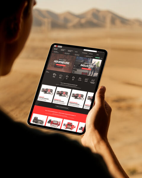
One brand, but two bold identities
Warrior Winches were on a mission to break into the highly competitive US market - a space dominated by established, homegrown brands. They needed more than just brute strength to make an impact. It was time to evolve the brand identity to cut through the noise of a crowded category and resonate with both industrial and consumer audiences. We were asked to refresh the brand and create two distinct identities for the B2C and B2B sides of the business. We had to strike the perfect balance – unifying the brand while allowing each side to thrive in its unique market.
- Brand identity
- Strategy
Our Approach
We began by diving into market research. The competitors were loud and bold, but often outdated. This gave us the perfect opportunity to disrupt the space with something fresh and forward-thinking.
Our design strategy focused on unifying the brand with shared elements like colour and shape, while allowing the industrial and consumer sides to stand proudly on their own.
With these foundations in place, we reintroduced Warrior Winches’ design principles, giving them a modern edge that aligned with their ambitious growth plans
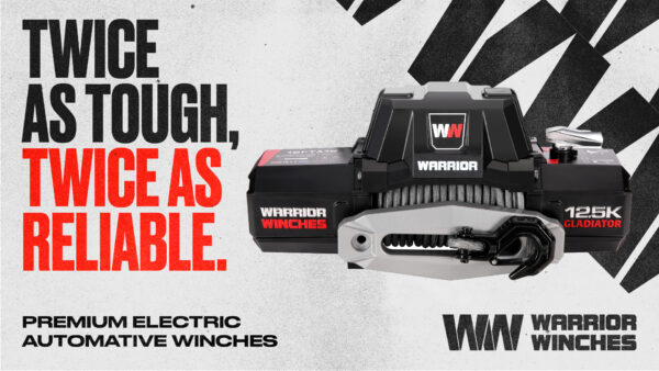
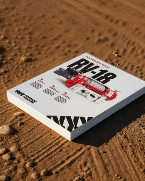
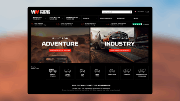
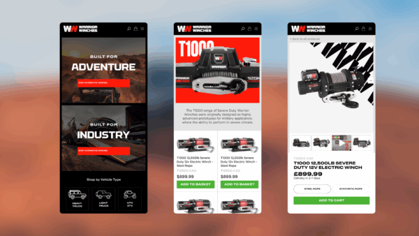
Twice as tough, twice as reliable: B2C identity
Warrior Winches Consumer caters to Adventurers and DIY Enthusiasts – those who live for the thrill of off-road challenges and need equipment as tough as their terrain.
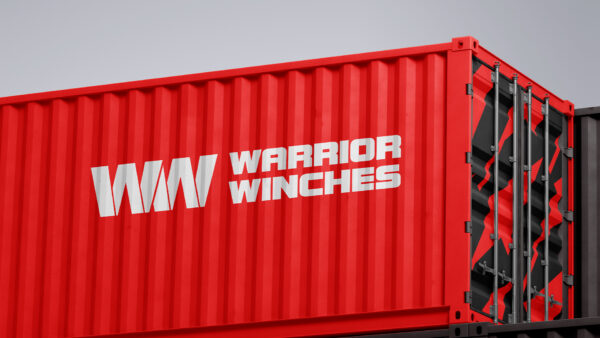
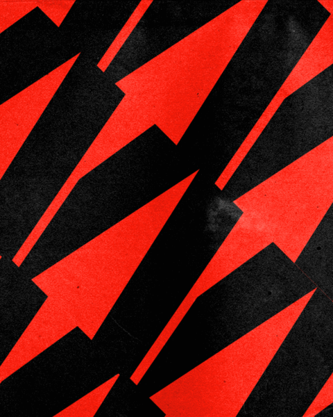
We developed a bold, adventure-driven visual identity that embraced ruggedness and performance. The logo evolved into a graphic icon of exploration and traction, symbolising double the strength and reliability.
A polished, energetic pattern inspired by the “WW” initials became a standout brand asset, instantly recognisable across materials.
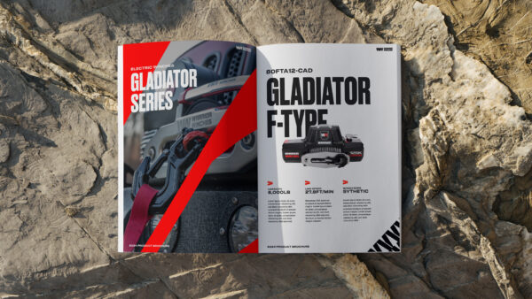
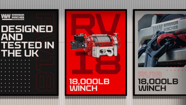
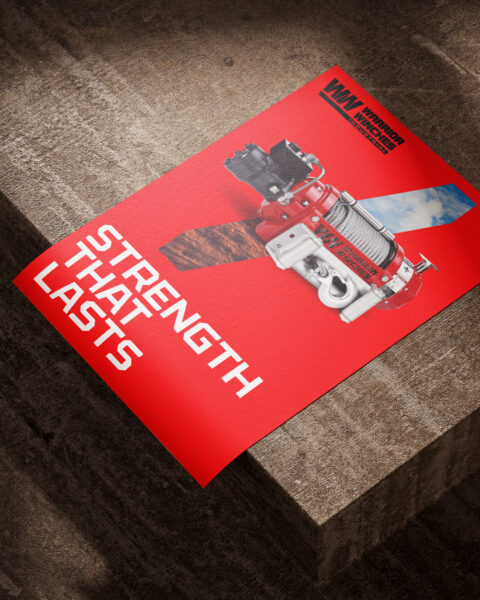
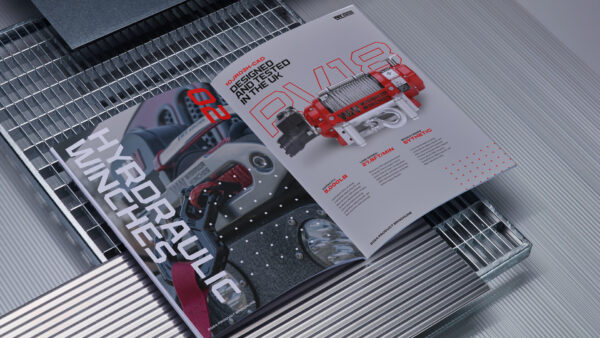
Strength that lasts: B2B identity
The industrial audience demanded strength, reliability, and professionalism to reflect the expectations of decision-makers in industries like engineering and construction.
We crafted a visual language rooted in advanced technology and industrial engineering, merging ruggedness with innovation. Evolving the type to a sharper, more technical style that emphasised professionalism. A dotted coordinate grid added a sense of structure and accuracy, ideal for industrial applications.
The outcome
The Warrior Winches refresh unified strength and adventure across two distinct markets. The consumer identity brought the thrill of exploration to life, while the industrial side conveyed professionalism and reliability.
Together, these identities created a cohesive family brand ready to tackle the competitive US market and pave the way for growth.
Related Work
View All