The Role Typography Can Play In Elevating Creative
Every aspect of a design plays a significant role in communicating the brand’s values, their mission and of course the intended message, from tone of voice, colour palette to the logo itself. Typography, in particular, stands out as a pivotal element in shaping the visual language of a brand, as fonts can communicate a vast array of personalities. This blog will explore why paid fonts are sometimes worth the investment, the difference between paid and bespoke typefaces and some examples from our recent projects at Spark.
Distinctive look & feel
A lot of work goes into premium fonts by type foundries to make them look and feel unique, setting them apart from the masses of free fonts available. This allows design agencies to pair a brand concept with a bespoke typeface, that visually matches and enhances the unique visual language of a design.
Greater control
Premium fonts often provide designers with a larger range of weights and assets to play with. Having this level of control helps us to hone-in on the intended message of the brand.
Better legibility and readability
Professional typographers pay meticulous attention to the legibility of their fonts. They ensure the correct spacing between letters, and also that the font is easy to read at their intended sizes. Ultimately, this positively influences the perception of brand work with a more professional look.
Wider language support
For brands that operate in various geographical regions, premium fonts often boast the extensive range of characters required to support different languages, ensuring effective communication across all territories.
Bespoke typefaces
Bespoke typefaces, also known as custom fonts, are tailor-made for specific branding projects. These can begin with an existing font from the type foundry’s library, or can be created from scratch, they are usually developed collaboratively between a design agency, type foundry and the client themselves.
When Dalton Maag visited Spark HQ they showcased a handful of bespoke typeface projects that offered a one-of-a-kind solution to clients. Maker’s Mark was one of the examples they showcased, it provides a subtle yet very effective twist to one of their existing fonts, inspired by the hand-crafted excellence and rough cask barrels of the whiskey maker.
Read more about their visit to Spark here.
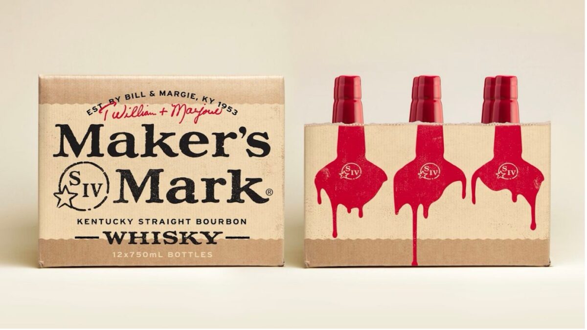
Dalton Maag / Turner Duckworth for Maker’s Mark
Lush’s Handwritten font was commissioned and drawn from scratch to give a bold, yet handmade feel to the Lush in-store experience. It was truly inspirational to see the hard work that goes into creating tailor-made typefaces.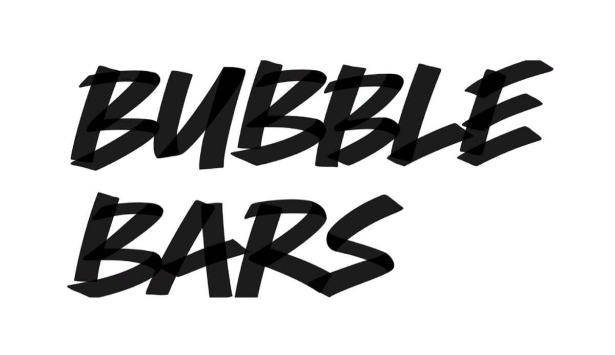
Dalton Maag / Method for Lush
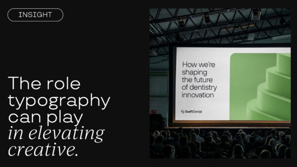
Swift Dental
We recently chose a paid typeface for Swift Dental selected to elevate the brand. Swift Dental position themselves as a progressive force within the dental industry, so we opted for a clean, technical yet unalienating typeface (TT Hoves). It was used to reflect their desire to drive change within the industry.
View the full case study here.

Creative Spark for Swift Dental – TT Hoves by truetype.org
When our aim is to elevate our clients brand identity, mission and purpose we consider every aspect of their brand including typography. Whilst free fonts serve a purpose, there are benefits to investing in premium fonts, for example they can enhance a brands personality, resulting in a more distinctive identity, as well as offering greater typographic control, legibility and language support.
For more example of Spark Branding projects, visit Work – Creative Spark