Client: Parfetts
Year: 2020
Brief: Naming, branding and packaging
The challenge
Parfetts had never launched an own-label product before, but with strong growth, the opportunity was there to step into the market.
The challenge was creating a cider brand that could sit confidently alongside established names, without feeling like an imitation.
Our approach
We started with research and built the brand from the ground up. The aim was to create something that felt premium but still approachable.
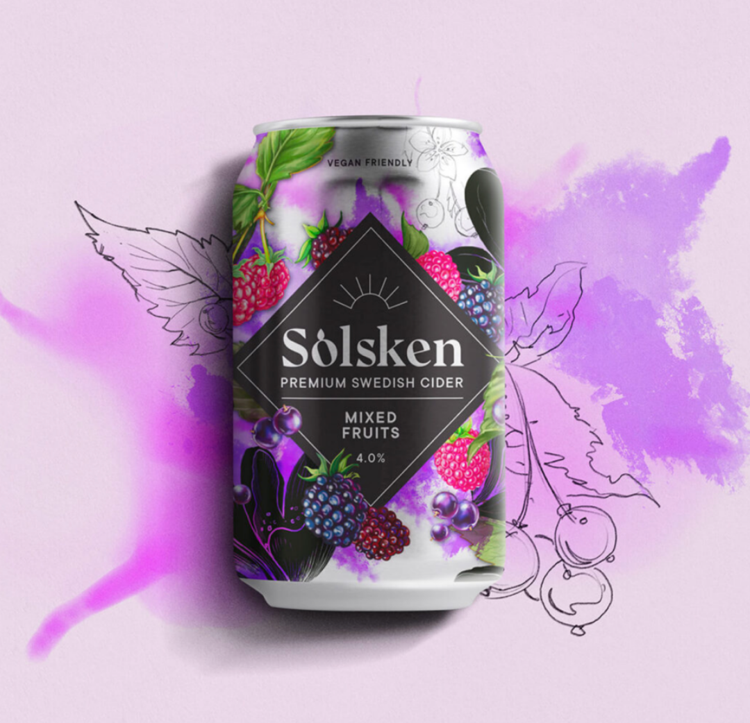
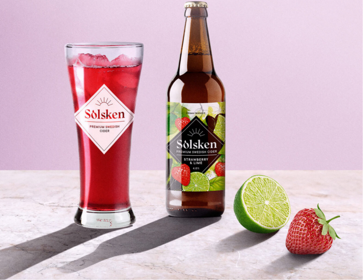
The name, Solsken, meaning sunshine in Swedish, set the tone. It captured the feeling behind the product. Easy, social, and made for sharing.
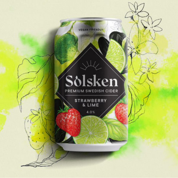
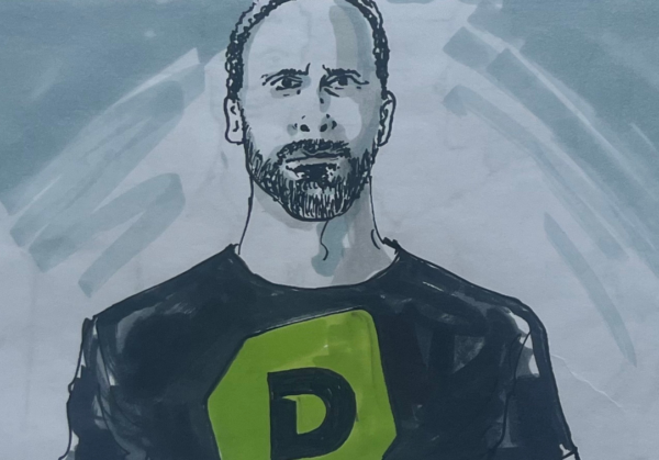
Visually, we took a more crafted route. Bespoke illustrations were created using freehand pencil and watercolour, giving the brand a softer, more expressive feel.
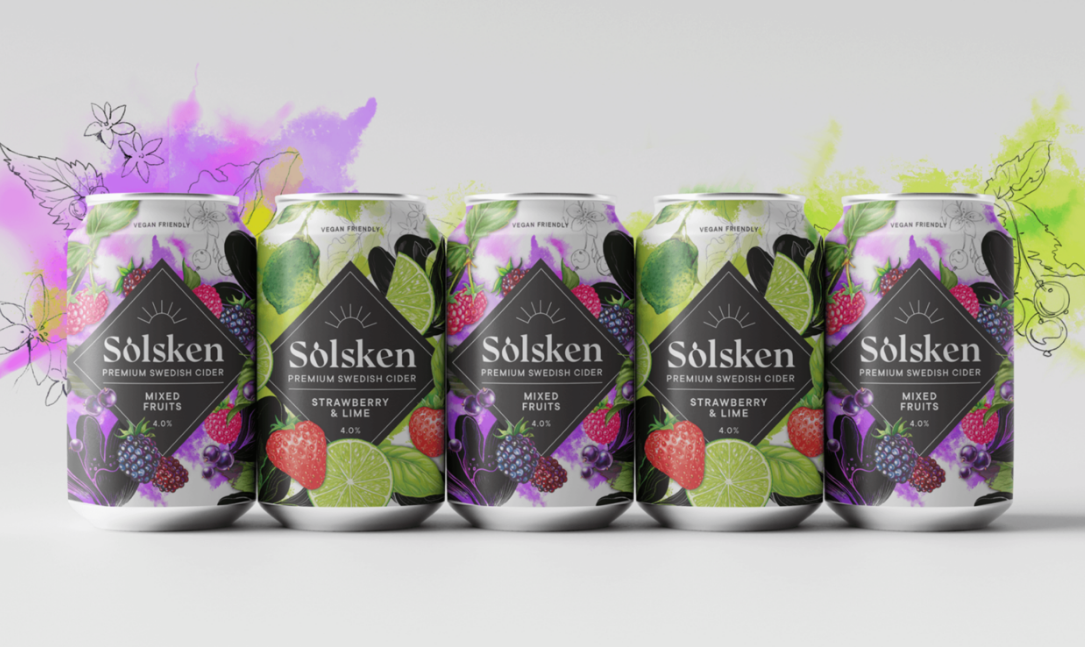
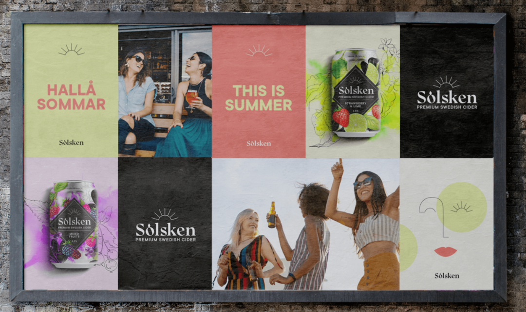
The style worked across multiple flavours and formats, from bottles and cans to outer packaging, creating a consistent but flexible system.
Alongside the launch, we developed a substantial brand toolkit that gave internal teams everything they needed to roll the brand out quickly and consistently.
The result
A distinctive cider brand with strong shelf presence. Premium, accessible and built to grow.
Solsken exceeded sales targets in its first six months and became the blueprint for Parfetts’ future own-label product launches.