Client: Hale Country Club
Brief: Brand and roll-out.
Year: 2012
If we were working on this brand today, we’d probably be sitting in meetings talking about trends like ‘Quiet luxury’ and ‘‘Royalcore’- the branding really has stood the test of time, and aged like a fine wine.
We’re immensely proud that the branding and crest that we developed is still going strong after 12 years of growth, expansion and even the 2016 THG acquisition.
A MEMBERS CLUB WITH A DIFFERENCE
The club set its sights on achieving something different from the corporate members’ gyms in the area. It was family-owned and nestled in the countryside, close to aspirational communities. It would ooze prestige while staying down to earth.
PLACE & PRESTIGE
Therefore, when it came to naming, we drew on the location of ‘Hale’ and combined it with ‘Country Club’, which suggested community and quality. This led us to a winning choice. It was an invitation to belong to an esteemed fitness community that was inclusive, not super-elite.
LUXURY DESIGN LANGUAGE
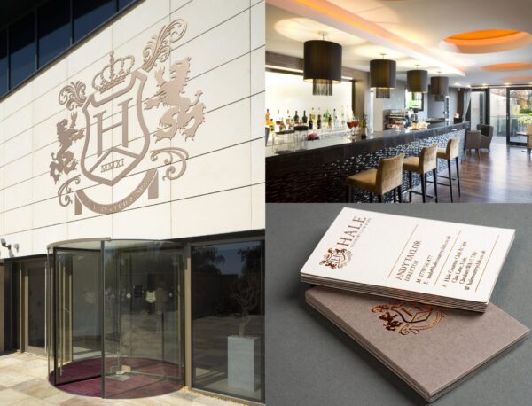
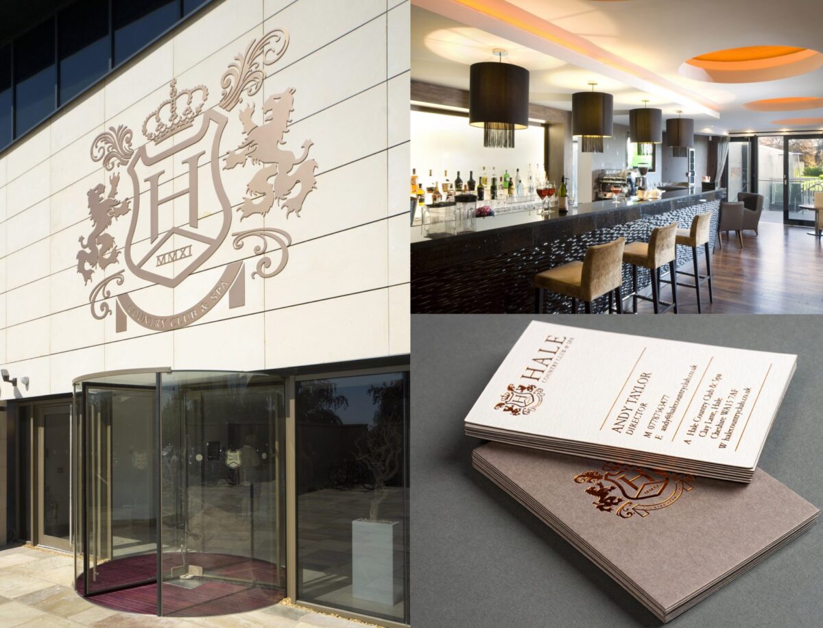
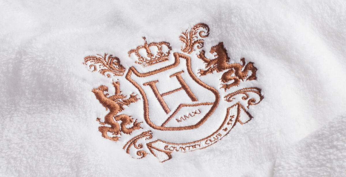
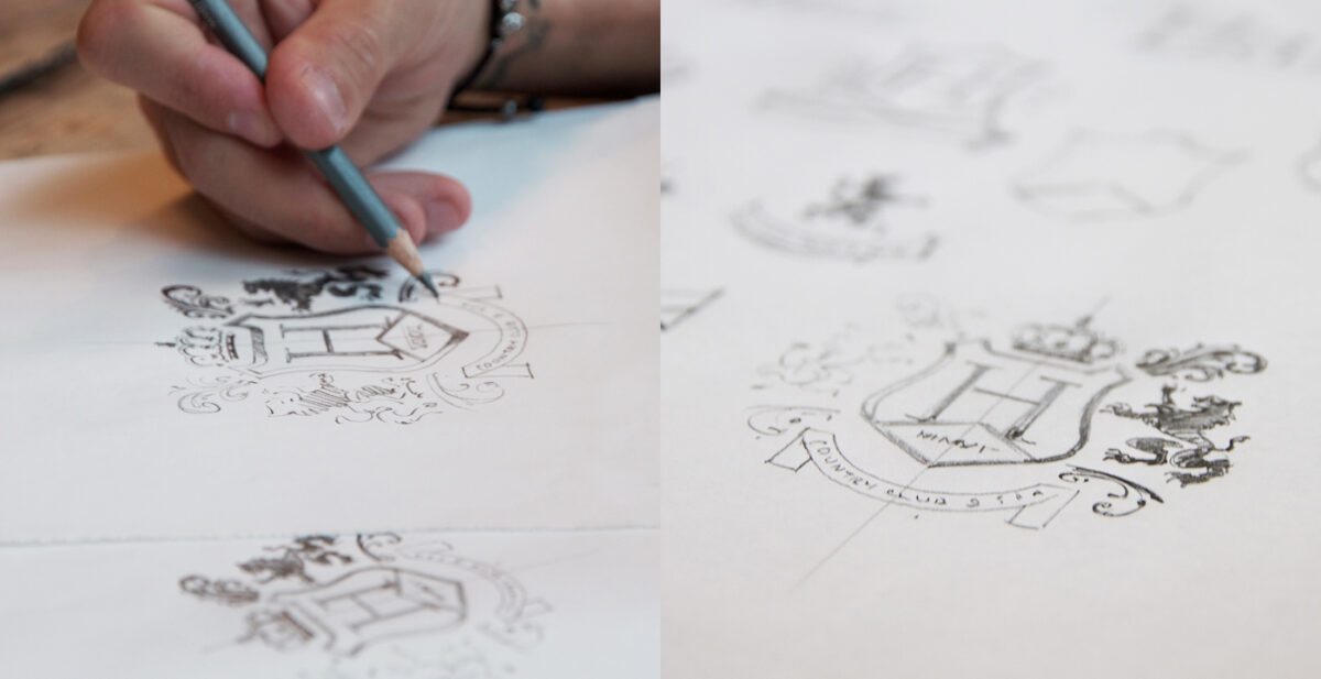
The hand-crafted bespoke crest, reminiscent of a heritage sports team, conveyed the appropriate design signals of belonging and prestige, which our customers could expect as members of the club itself.
EVERY DETAIL WAS THOUGHT OF
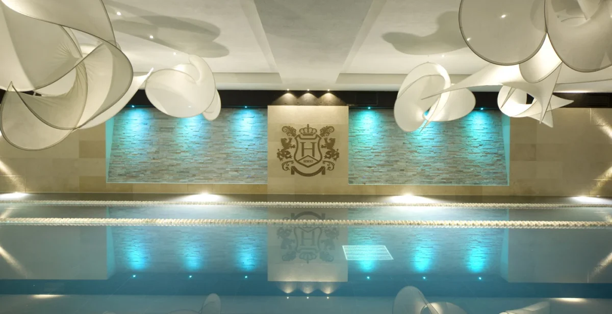
We pored over the details of each touchpoint for roll-out, from luxury stationery and signage to interior design, dressing gowns, and towels. The physical experience was then brought to life online through their website and social collateral.
THE IMPACT
We helped create a renowned fitness club and community that continues to drive demand and desirability to this day. We’re immensely proud that the branding and badge are still going strong following 12 years of growth plans and THG acquisition.
Are you ready to be unstoppable?
Build a successful strategy with the agency championing ambitious brands for over 20 years.
Talk to Neil today: [email protected]