CERT Properties

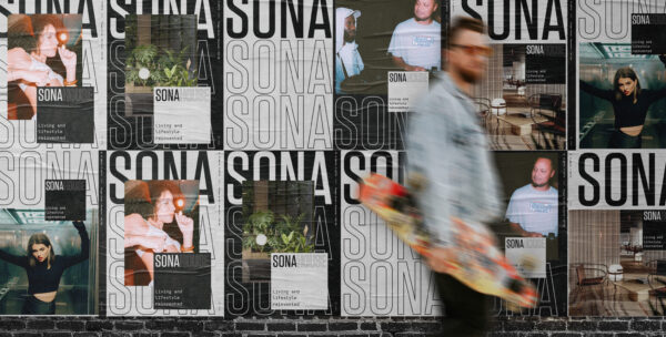
Cert Properties is a Manchester based property and investment developer specialising in residential and commercial development. They wanted to create a visually appealing and relevant style for their new development, Sona. We created a new brand identity, including the name of the development, as well as a full roll out of how the style would work in the real world. The second phase involved website design and development to bring the property to life.
- branding
- naming
- tone of voice
- brand style
- web design
- web development
The Name Game
After initial market research and discovery sessions we started the naming process, driven by the needs and wants of the target demographic. The naming process consisted of different territories, with botanical influences, names that depicted shapes and the chosen route, connotations of sound; Sona. A derivative of the word ‘Sonar’, with reference to music (sound and sonar festival), Sona is a collective synergy of vibrations and energy. A showcase of the soundtrack to the city with a full spectrum of people.


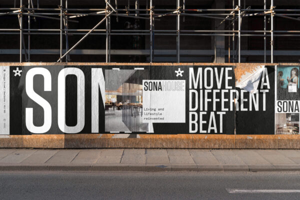
Move to a different beat
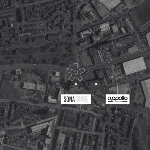
The Sona brand strapline takes influence from the omnipresence of music and culture, that is grounded in the community in the area they are proud to be part of. A spectrum of senses and people as one collective. The development is stones throw away from the iconic Manchester Apollo theatre synonymous with the Manchester music scene – a scene that has always ‘done things it’s own way’, we felt the essence of the statement was an appropriate nod in honour to this. Brand Identity Creation offered a full spectrum of assets including logo and brand marque creation, brand guidelines inclusive of graphic style, tone of voice and web design.
The Sona ‘Roundabout’ brand marque was conceptualised from the recognisable roundabout in the area of Ardwick in which both the Sona development site and Manchester Apollo are situated. A busy junction that connects the area to the city, other boroughs and beyond, it appropriately forms the shape of a cog-like symbol. It was the perfect bit of serendipity you hope to find when developing a project concept and leans heavily into the symbolism of the ‘working together’ aspect the area is known for and proud of – exactly the type of people Sona are hoping to attract, live and thrive in the development.


Bringing Sona
to life
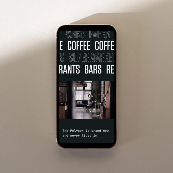
We created a fully responsive website build on Wordpress. Bringing across the energy and vibe of the brand was really important for the digital presence, we brought this through through scroll based animation and subtle motion applied throughout.
Ready to make your brand Unstoppable?
Let us help you reach your goals:
Stand out in your market
Maximise impact with insight-driven creativity
Turn complex solutions into compelling campaigns
Creative Spark is the agency that gets it done. See how we can transform your next campaign. Book a call today.
