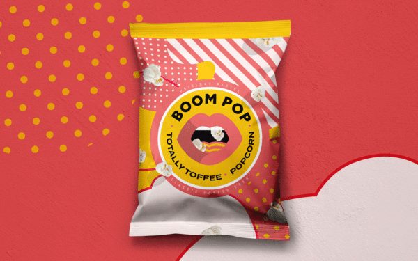
Boom Pop
With people spending more time at home over the last 18 months Parfetts spot an emerging desire from customers to relive their cinema experience but in the comfort of their living rooms.
- Market Research
- Brand Position
- Brand Naming
- Trademarking
- Packaging Design
- Artwork
- Repro
- Brand
- TOV & Copy
- Social Media
- In Store POS / SRP
The Brief
As the North West’s leading independent and employee-owned symbol group, Parfetts is extremely well known and respected by retailers and caterers across the region. With people spending more time at home over the last 18 months Parfetts spot an emerging desire from customers to relive their cinema experience but in the comfort of their living rooms. The brief? “Create a design that catches the eye of the casual shopper making an impulse buy in their local corner shop.”
Careful market audits and consumer research yields high impact, effective design
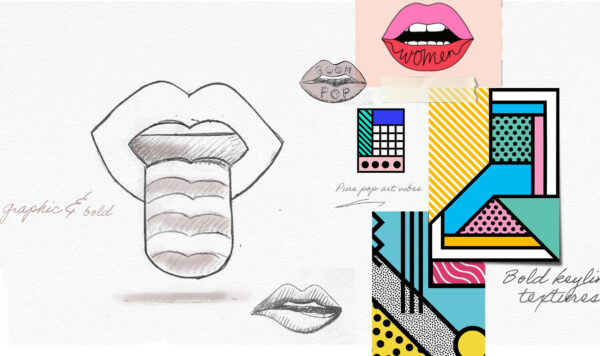
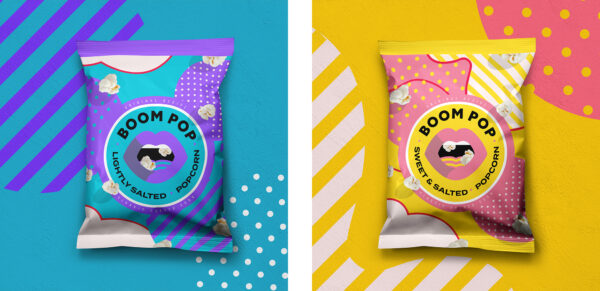
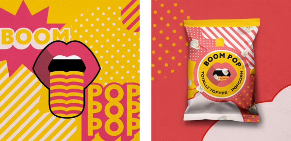
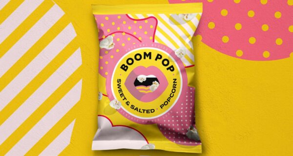
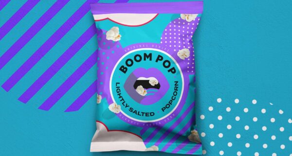
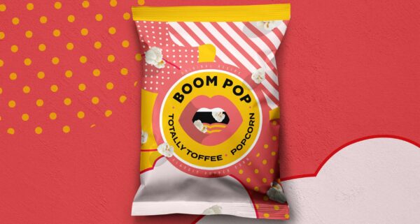
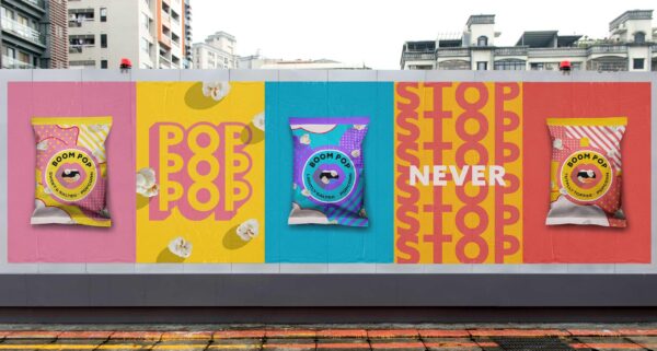
Relying on our market audit and observations, we optimised the product packaging to enable a quicker ‘read on-shelf’ and enhanced appetite appeal to get it in the baskets of shoppers. After running designs through consumer testing to validate messaging and communication hierarchy, our end result was a package that features colourful gradient of fun pop art style graphics with colourful popcorn loving lips, showing the lightheartedness of the product.
A product line dependent on clear communication at every level
Having a wealth of experience in the FMCG sector, Creative Spark was no stranger to the challenges of cutting through the clutter of neighbouring brands on the shelves. Hitting the ground running, we applied a process already proven successful in rebranding 1000’s of SKU’s over the years, including Nisa’s Heritage range, Booths, Kingsland Drinks to name but a few. The aim? To discover a truly unique proposition in an already crowded category that automatically creates stand out products. The true challenge however, would be finding the sweet spot between commercially aware creative that would be “fit for purpose” and fly off shelf’s, to a design that would be more than comfortable alongside established market leaders.
Creating the BOOM!
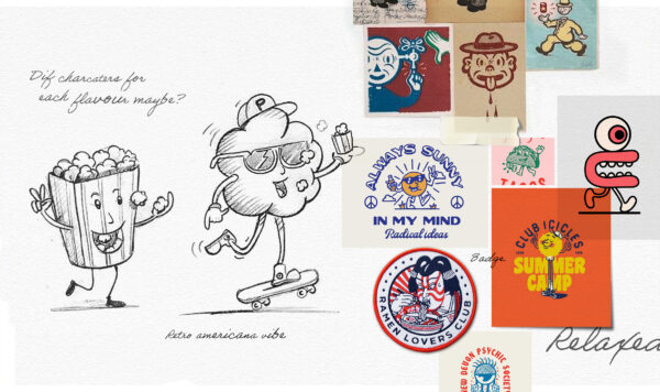
After rounds of potential names and varying designs, all sides firmly agreed that “BOOM POP” had the maximum impact to tempt any impulsive shopper away from recognised brands – a challenger brand that truly does challenge. To truly represent the product we knew we would need to draw inspiration from the product itself. The result was a super bold, fun, and colourful pack design. Derived from the energetic “pop” of the corn with its chaotic popping nature, a larger than life bold type was chosen with devouring pop art lips showing the way we all LOVE to enjoy popcorn where more really is better!
Ready to make your brand Unstoppable?
Let us help you reach your goals:
Stand out in your market
Maximise impact with insight-driven creativity
Turn complex solutions into compelling campaigns
Creative Spark is the agency that gets it done. See how we can transform your next campaign. Book a call today.
Related Work
View All