Creative Spark are a brilliant agency to work with. From Day 1, the understood the brief, and worked hard to deliver a true transformation in the brand (on time)! They delivered a brand evolution that we’re incredibly proud of. I can’t wait to work on our next project together.
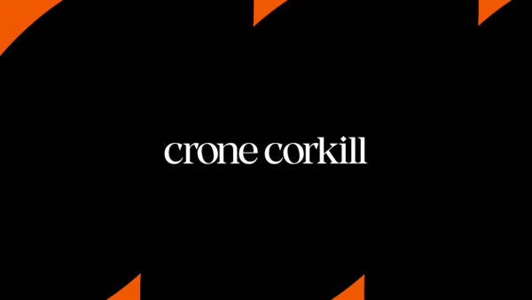
Crone Corkill
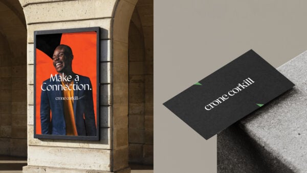
Make a connection
When we were approached by RGF, owners of high-end recruitment company Crone Corkill, we were excited about where we could take their unique brand in terms of its visual identity and tone of voice. Crone Corkill is a heritage brand. For the past 40 years it’s earned a reputation for placing high quality candidates in business support roles including IT, marketing, HR and finance but this wasn’t coming across within its existing brand.
- Brand
- Brand Guidelines
- Strategy
Taking a people-first approach
In order to get to the crux of what Crone Corkill do and how they have a real and positive impact on their clients, employees and stakeholders, we organised a series of interviews with key players to find out how they are really perceived by the wider world.
What came out of this brand research is that everything that they do genuinely matters to them. They have incredible personal relationships with clients and customers. They don’t just tick boxes, they partner with their clients on their career journey – it feels really personal and this is what makes them noticeably different when compared to other companies in the marketplace.
Creating cut-through in a competitive marketplace
While the people within the business are passionate about what they do, and this comes across on a one-to-one basis, their brand identity just didn’t stand out. Crone Corkill felt that, visually, they had no cut through in a very competitive sector where everyone was delivering the same message in a similar way.
We could immediately see that Crone Corkill needed an identity that defined their unique approach and bespoke service, and we knew just how to get to the heart of the answer.
Bringing the message to life
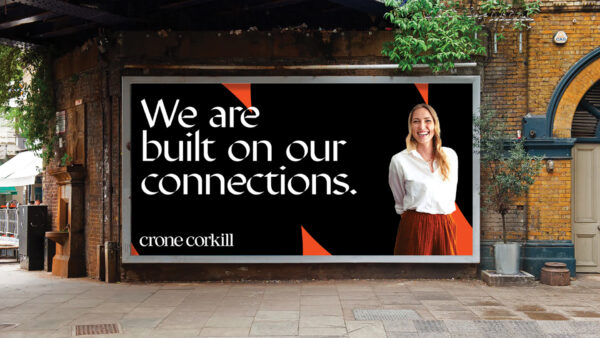
Our proposition for re-shaping the brand was Make a Connection. While recruitment can be seen as a numbers game, at Crone Corkill it’s all about connecting people with people and treating everyone as an individual.
Our aim was to develop a brand that showcases the company’s independent spirit, experience, high-end values and love for what they do, and we brought this to life by evolving their tone of voice and creating a set of golden rules to ensure copy is conversational and has a believable, friendly and confident warmth.
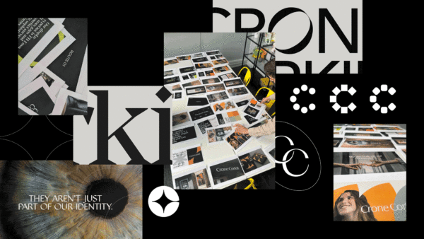
A memorable brand identity that lives up to its promise
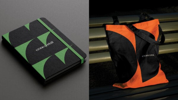
For the visual identity, we developed a sophisticated and classical look that would give them a boutique feel and reflect their heritage. The revised logo is sophisticated and modern. It’s a simple word mark paired with a humanistic, detailed typeface.
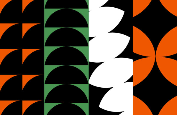
The colour palette also reflects the sophistication of the brand. Keeping to four colours gives it a confident edge. It’s editorial in its approach – soft and elegant, not loud or in your face. The clever graphic treatment enhances the message around making connections – the intertwining shapes are an abstract way of signifying the moment of meeting and represent the real and long-lasting relationships that blossom from that.

Ready to make your brand Unstoppable?
Let us help you reach your goals:
Stand out in your market
Maximise impact with insight-driven creativity
Turn complex solutions into compelling campaigns
Creative Spark is the agency that gets it done. See how we can transform your next campaign. Book a call today.
Related Work
View All