Philpotts

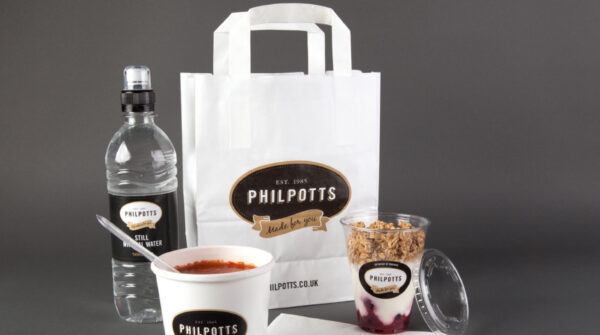
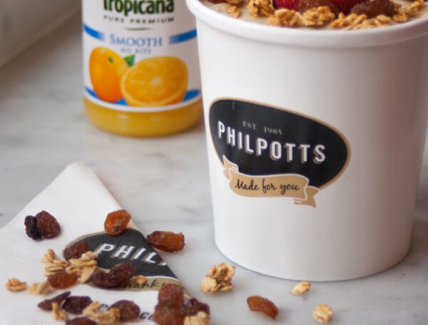
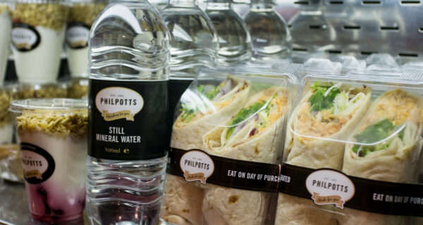
Sandwich makers Philpotts have served the North’s hungry for over 25 years but as they had expanded, their branding had gotten a little soggy. They came to us hungry for something fresher, a brand with a crisp, modern feel to reflect their new status. To that end, we served up a new company logo, a re-designed packaging design and even a spruced-up menu. We used the company’s existing colours served as our base, meaning we could retain the spirit of the old brand (and its equity) while giving ourselves enough leeway to rustle up something that bit more appetising for a modern audience.
- branding
- design
- strategy

The Job
To modernise the beloved butty brand while staying true to their history
The Spark
Turn the eye-watering into the mouth-watering


Ready to make your brand Unstoppable?
Let us help you reach your goals:
Stand out in your market
Maximise impact with insight-driven creativity
Turn complex solutions into compelling campaigns
Creative Spark is the agency that gets it done. See how we can transform your next campaign. Book a call today.

