Re:Treat at The Lowry Brand Identity
At Creative Spark we’re privileged to be creative partners with The Lowry Hotel, and have enjoyed working together for over 12 years. Along with the hotel team, we’ve developed successful brands for The River Restaurant and The Lowry Bar. So when they approached us to develop a name and brand for their new wellness spa, there was no hesitation. The team revealed that the new development would be no ordinary spa. They’d moved beyond the traditional swimming pool and sauna that people might expect. This would be a sanctuary offering an extensive range of therapies and experiences. A space that would hone in on the four specific pillars of true wellness - Social, Emotional, Spiritual and Physical. A place to escape and unwind, where inner balance could be restored, using methods tailored to specific needs.
- Design
- Brand Identity
- Creative
- Art Direction
- Naming
Re:defining spa
Our first task was to define a name for the wellness spa. The name needed to help define what the spa offered, as well as be ownable by The Lowry Hotel.
Together we explored a range of potential naming territories, from the artistic to the abstract, before arriving at a name we were all excited about - Re:treat at The Lowry Hotel.
The name uses a simple and very relevant word that has been altered with a colon to add ownability and also to create a versatile marketing device.
Adding the colon expands the capabilities of the name, making it adaptable and able to represent the four areas of wellness. The ‘Re:’ would be a consistent theme that flows through the brand communications, helping to reinforce the values of the brand and
build a strong identity.
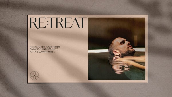
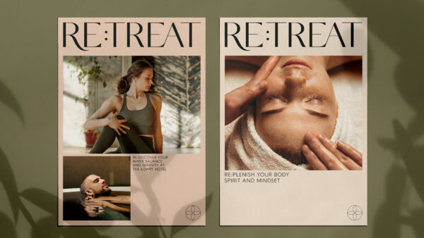
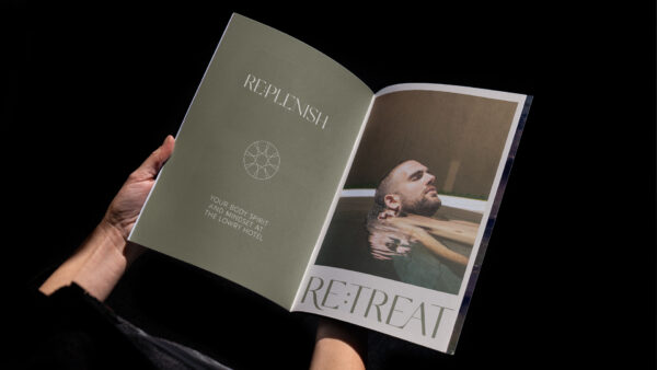
Re:flecting wellness and balance
With agreement on a name, our focus turned to the creative identity. We wanted the brand to feel contemporary, spiritual and refined. Something that would reflect personal wellness and inner balance in an inclusive and intriguing way
For the logotype, our team selected a beautiful Serif font which was hand-crafted with custom typographic flourishes.
This was paired with a discreet and calming marque in the form of a four-petalled blossom, referencing perfect balance. The petals depicted the four pillars of wellness - each one as vital as the next to create true personal wellbeing.
Re:leasing the brand potential
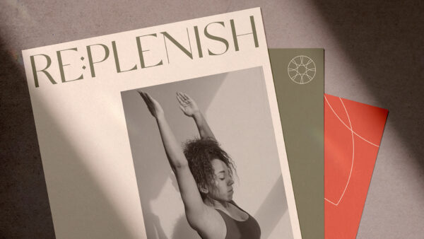
To further develop the brand identity we looked to the materials and styling that was planned for the spa itself.
We developed a colour palette that combined soft and calming colours with some that were more vibrant and possibly unexpected. This created a diverse and rich colour assortment that worked together in harmony or as individual highlights.
The style was further enhanced by editorial style photography, focusing on macro-crops of the human form along with moody lighting and shadows shot within the retreat studio.
We also designed and developed a series of motion graphics and short film utilising the brand assets and style. Created for use on social media, they brought the Re:treat brand to life, revealing the special features of the spa and the unique offering that The Lowry Hotel have created.
Ready to make your brand Unstoppable?
Let us help you reach your goals:
Stand out in your market
Maximise impact with insight-driven creativity
Turn complex solutions into compelling campaigns
Creative Spark is the agency that gets it done. See how we can transform your next campaign. Book a call today.
Related Work
View All