Pure Padel

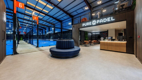
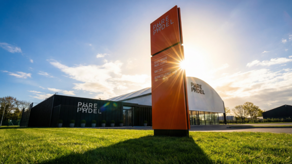
Pure Padel is on a mission to make padel the UK’s most accessible and inclusive racquet sport, with plans to open 30 clubs in the next five years. With top-tier facilities, expert coaching and a welcoming community, it’s a place for players of all levels to connect and grow. Padel is more than just a sport – it’s a fast-growing movement in the UK, combining athleticism with social fun. Pure Padel turned to us to elevate their brand ahead of the launch of their flagship Manchester site – the North West’s first indoor padel court. Our task: to create a bold, scalable brand toolkit that supports their ambitious growth and positions them as leaders in the booming market.
- Brand identity
- Strategy
- Website
Crafting a Brand That Connects
To evolve the brand, we first immersed ourselves in Pure Padel’s core values and future goals. Through stakeholder workshops, competitor analysis, and research into the sport’s culture, we shaped a direction that preserved the brand’s essence while unlocking its full potential.
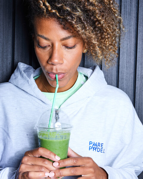
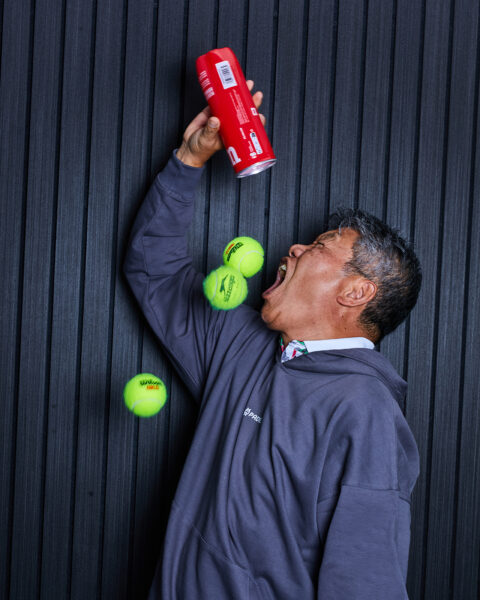
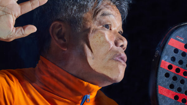
Rooted in accessibility, community and inclusivity, Pure Padel connects people through a shared love of the game. This vision guided every element of the brand’s evolution, positioning Padel as not just a sport, but a bridge between people, backgrounds, and experiences. Pure Padel provides a space where the thrill of competition and the warmth of camaraderie thrive side by side.
A Visual Identity that Reflects Padel’s Energy
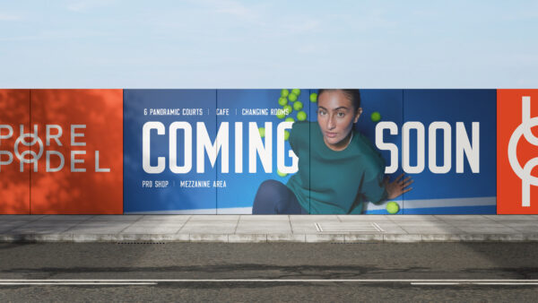
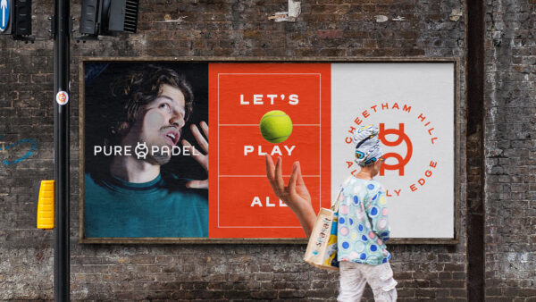
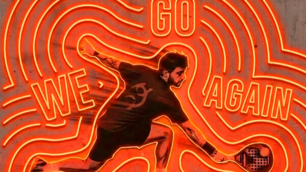
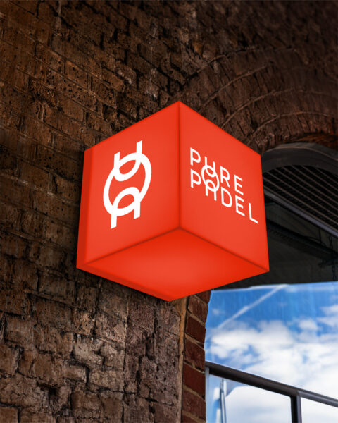
The challenge was to evolve the visual identity into something bold, modern, and versatile for future growth. The refined logo kept key elements of the original while adding a dynamic touch: the fusion of the "u" in "Pure" and "Padel." This subtle motion reflects the energy and connection of a padel ball in play, making the logo stand out in a crowded market.
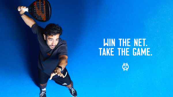
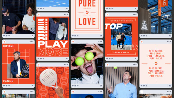
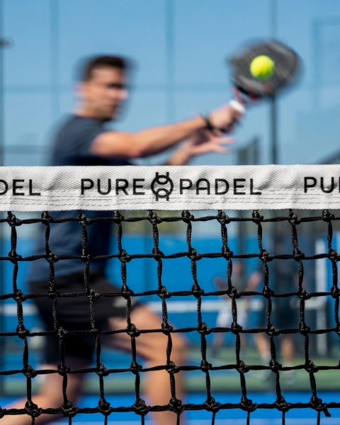
A refreshed and vibrant colour palette added vibrancy while staying true to the brand’s roots and paired with geometric graphic elements inspired by padel courts, created a flexible visual system that works seamlessly across all touchpoints, from court signage to social media. The tone of voice evolution further brought to life the adrenaline, fun, and camaraderie that Padel embodies.
Equipping Pure Padel for Expansion
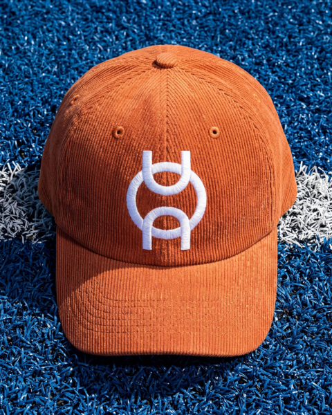
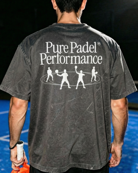
To support Pure Padel’s growth, we created a comprehensive brand toolkit to ensure a consistent, impactful brand experience across all touchpoints, helping Pure Padel maintain its identity as it expands.
From Vision to Reality: The Success of Pure Padel’s Rebrand
The refreshed brand has established Pure Padel as a key player in the UK’s padel scene, poised to leverage the sport’s growing popularity. The launch of the Manchester site has already sparked excitement, setting a new benchmark for padel clubs in the region.
Ready to make your brand Unstoppable?
Let us help you reach your goals:
Stand out in your market
Maximise impact with insight-driven creativity
Turn complex solutions into compelling campaigns
Creative Spark is the agency that gets it done. See how we can transform your next campaign. Book a call today.
Related Work
View All